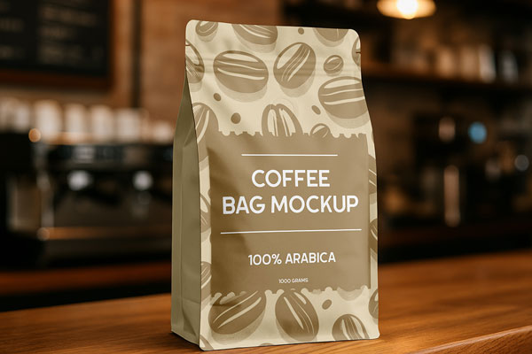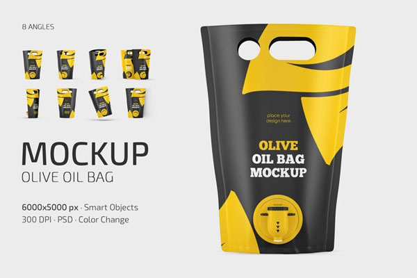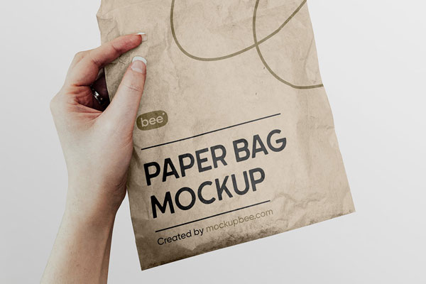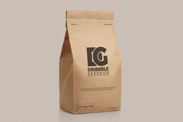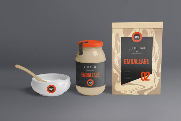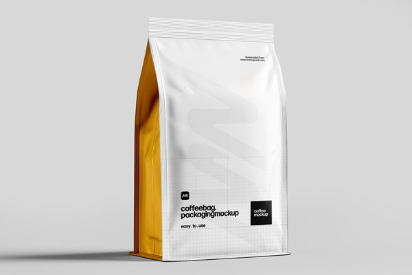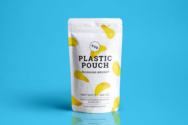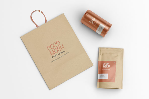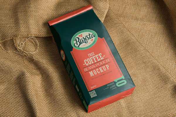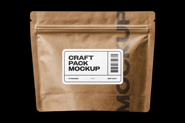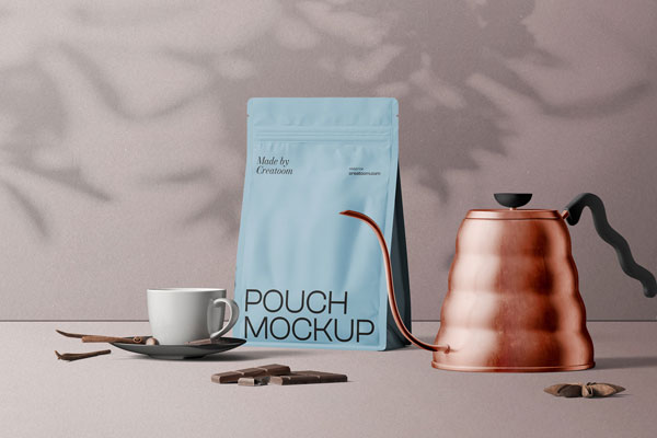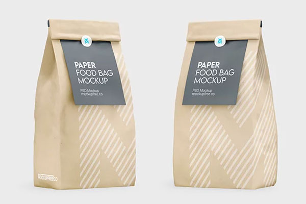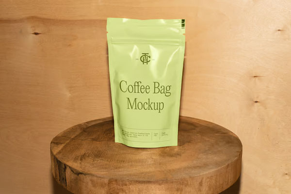
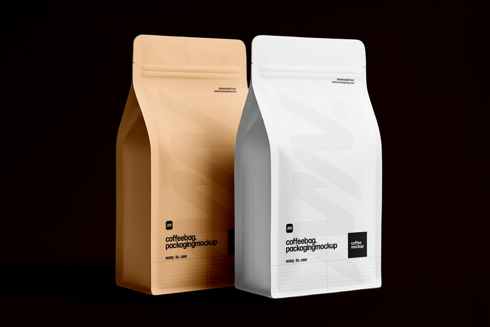
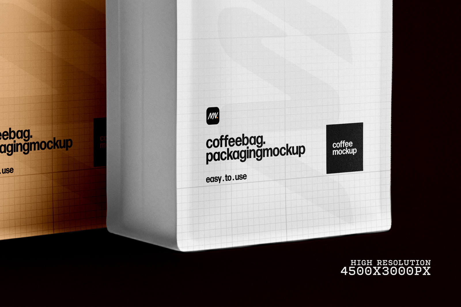
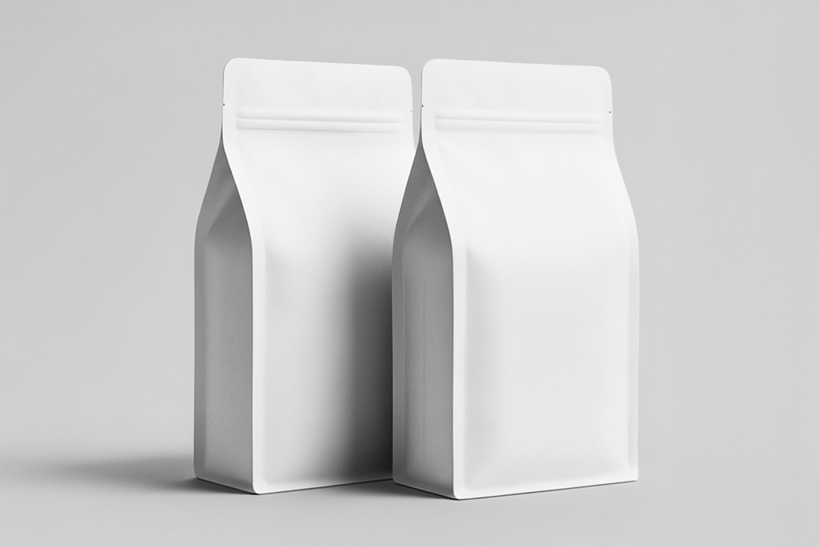
Coffee packaging isn’t just about containment; it’s about identity in a moment. When someone picks up a bag of beans, their eyes scan the label first, then their fingers feel the texture, and finally their senses imagine the aroma inside. That’s exactly why this minimal coffee bag packaging mockup is such a useful design tool. The clean, restrained presentation removes visual noise and lets your logo, color system, and label typography take center stage, while subtle shadows and natural proportions help you judge how the design feels in real life.
Artisan roasters, café brands, specialty blends, subscription coffee lines, and lifestyle launches all benefit from this pouch mockup. Sometimes great packaging isn’t about loud graphics; it’s about quiet confidence that feels intentional the moment someone touches it.