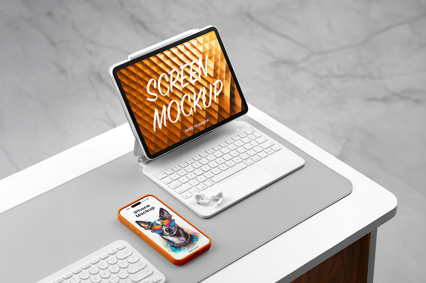
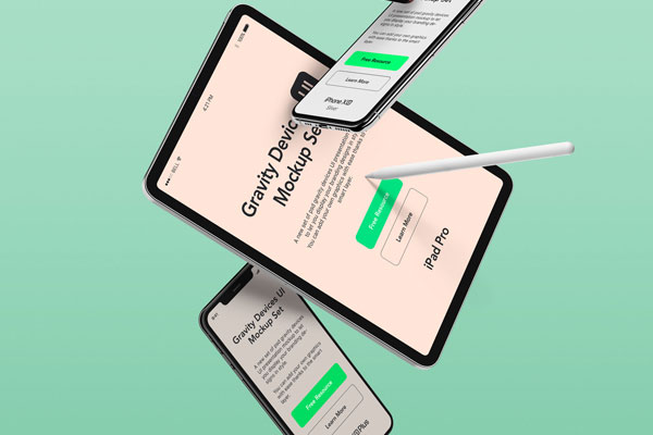
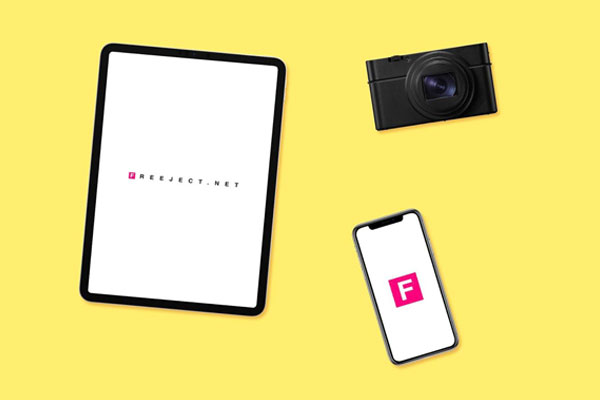
Designing for a single device is easy. Designing an experience that feels consistent across multiple screens is where things get interesting. That’s exactly why iPhone-and-iPad mockups are so useful. The moment both devices appear side by side, you stop judging individual screens and start evaluating the entire product ecosystem. Navigation, spacing, branding, and visual consistency suddenly become impossible to ignore. This mockup helps with that shift in perspective.
Apps, SaaS platforms, dashboards, e-commerce projects, and digital products all benefit from seeing how the experience translates across devices. Because in the real world, users rarely interact with just one screen.