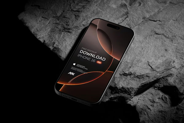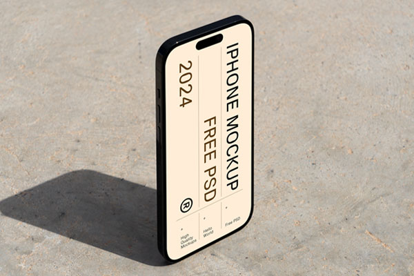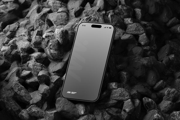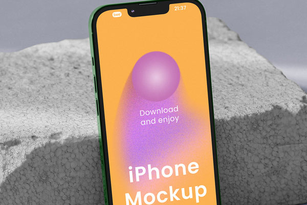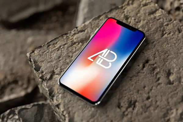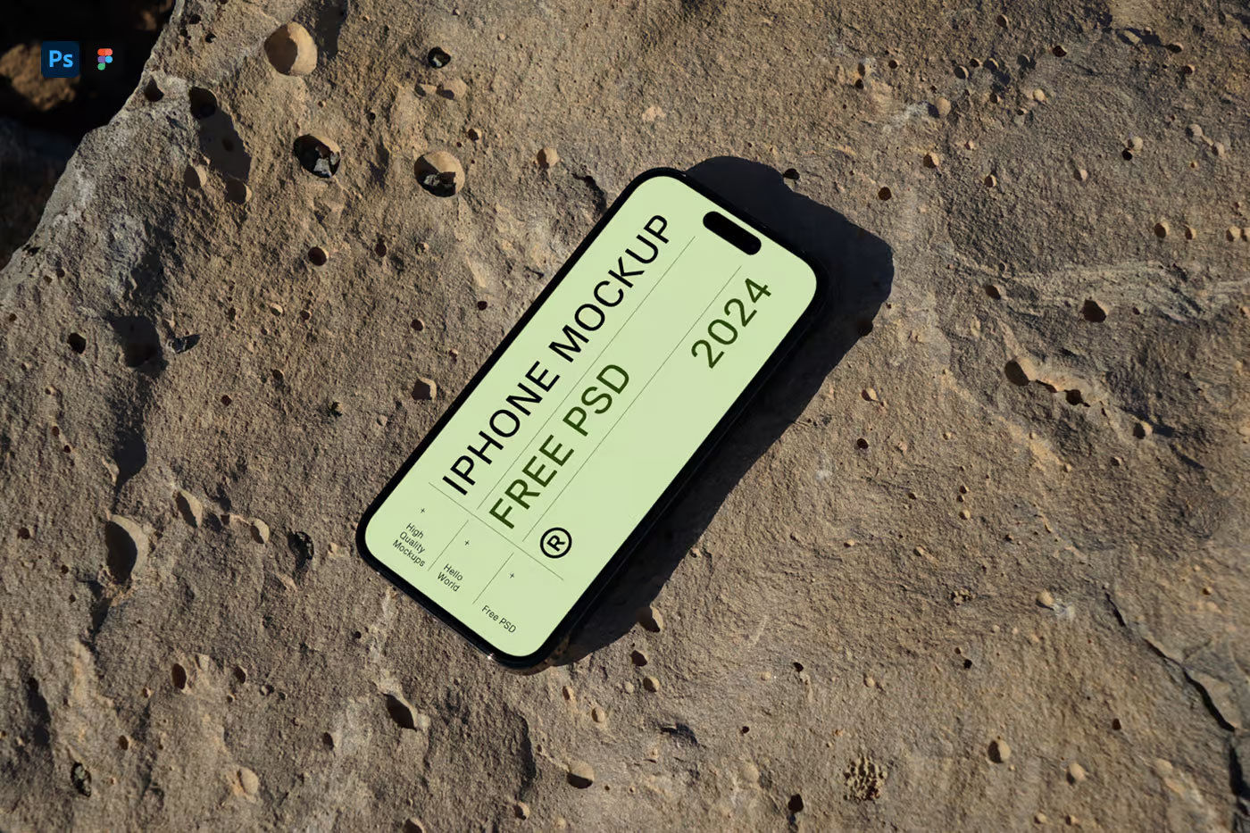
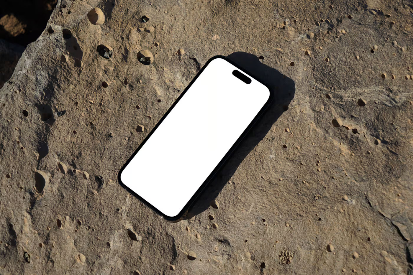
Some mockups feel like they’re trying way too hard to look futuristic. Floating devices, dramatic shadows, impossible angles; everything screams for attention except the design itself. This iPhone mockup avoids that trap. The rock surface adds just enough texture and contrast to make the iPhone stand out without turning the scene into a sci-fi poster.
What’s interesting is how naturally it balances technology and material. Your UI, branding, app design, or landing page still stays in focus, but the presentation feels less sterile than a plain studio mockup. Sometimes a small environmental detail is enough to make digital work feel more tangible.