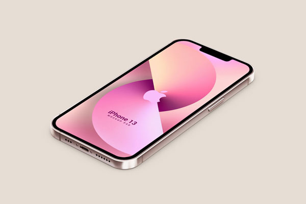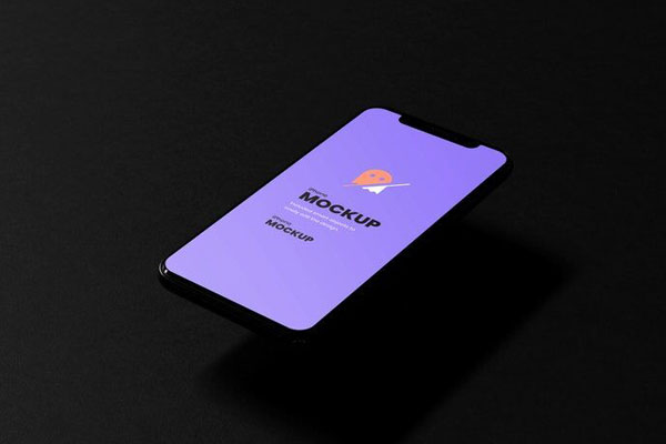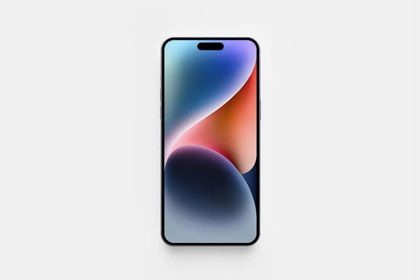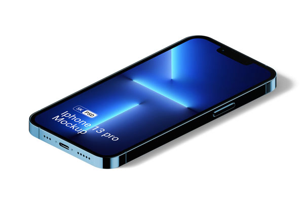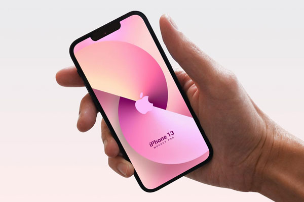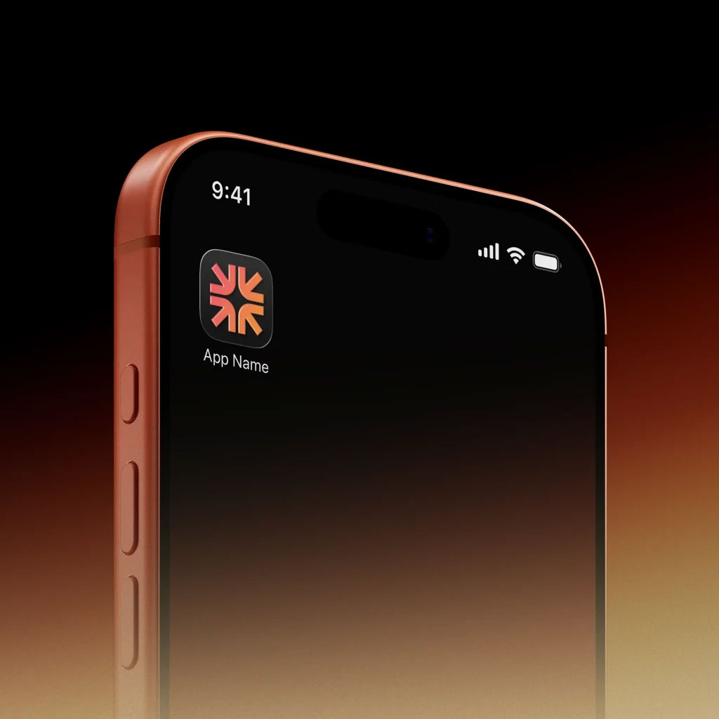
App icons are tiny. They sit on crowded home screens next to dozens of other visuals, and somehow people still recognize the good ones instantly. That means you don’t get the luxury of size, animation, or space to explain yourself; you only get impact. This mockup helps you test that. The clean iPhone presentation and gradient background put all the pressure on the icon itself, making it easier to judge whether your shape, color, and visual language are doing real work instead of just looking pretty.
Whether you’re designing for iOS UI, product launches, portfolio showcases, or app store branding, this iPhone mockup helps you see whether the design will actually be noticed among all the clutter.