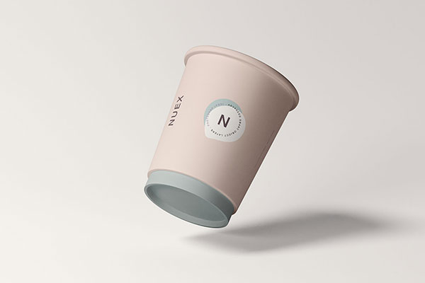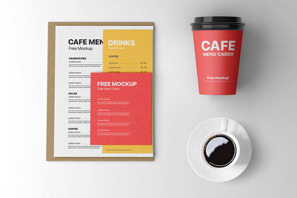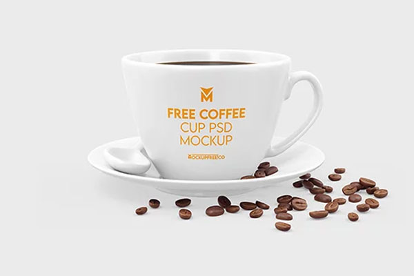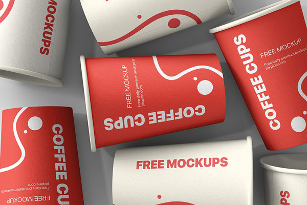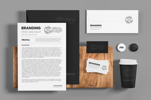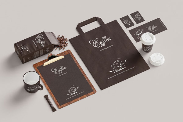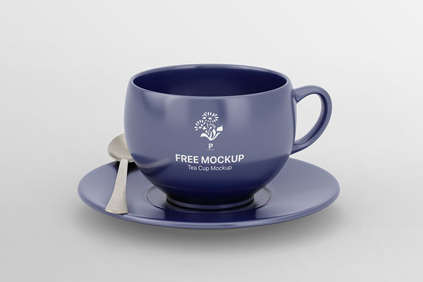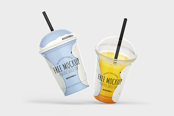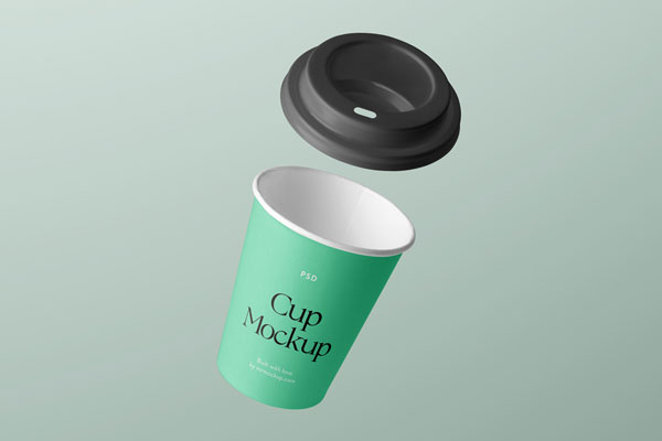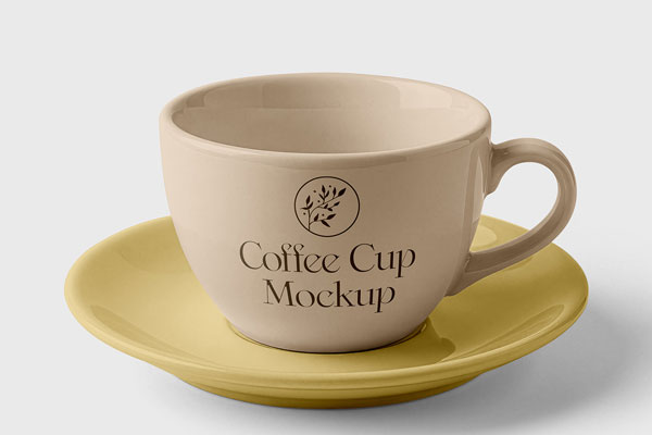
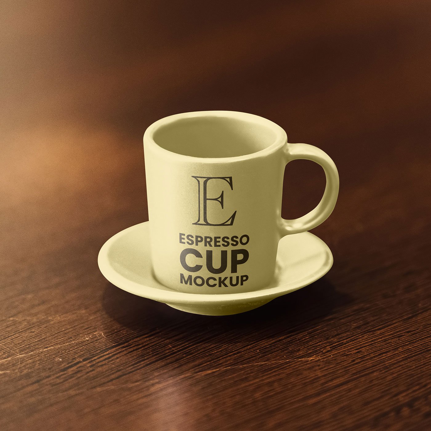

Espresso cups are tiny, which makes them surprisingly unforgiving. With so little surface area to work with, every design choice has to earn its place. A logo that feels balanced on a poster might suddenly feel oversized. Typography that looked elegant on screen can become unreadable in an instant. That’s exactly why this espresso cup mockup is such a valuable test. The small porcelain cup and saucer create a realistic café setting where branding is judged at the scale people actually experience it.
Coffee roasters, specialty cafés, boutique restaurants, hospitality brands, and artisan food concepts all benefit from that perspective. Sometimes great branding isn’t about having more space. It’s about making the most of the space you have.