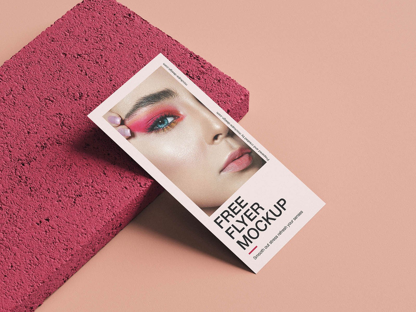
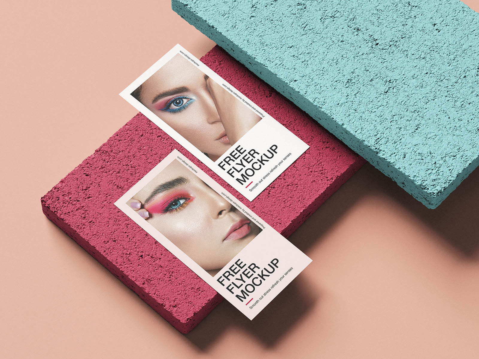
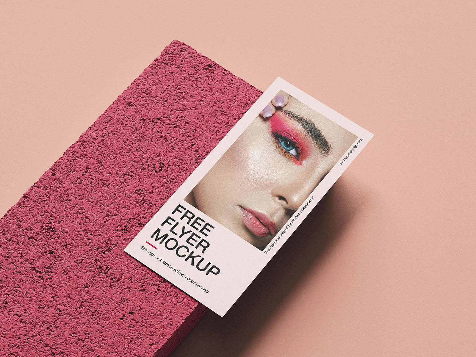
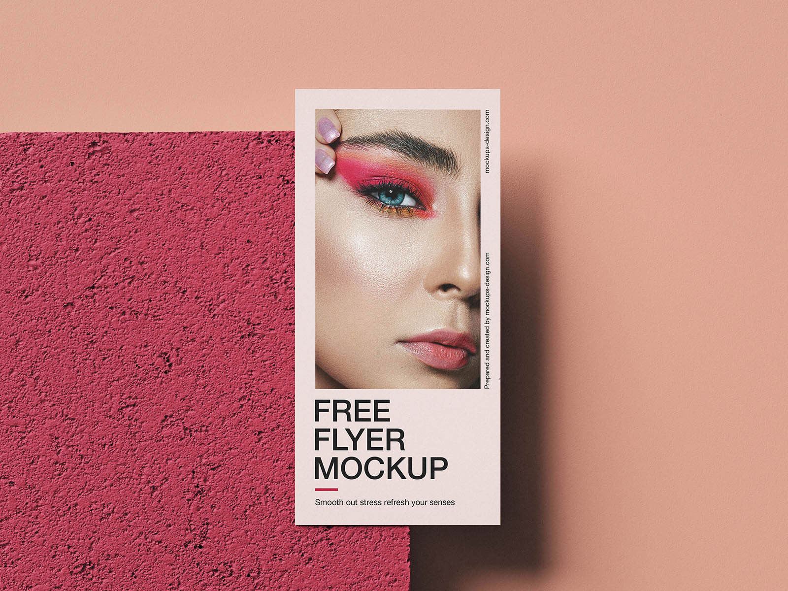
Flyers rarely live in perfect environments. They get pinned, stuck, stuck on rough surfaces, taped up without care, and sometimes ignored until someone notices them later. That’s exactly what makes this stone‑tile flyer mockup so useful. The texture gives the design a real context, forcing you to think about contrast, visibility, and readability as if someone stumbled across it in a city plaza, café wall, or community board.
Event promos, fashion campaigns, cultural outreach, grassroots branding, and indie concerts all benefit from that bit of reality. Sometimes a flyer’s success isn’t about pretty graphics; it’s about whether it “gets seen” in the wild.