The new typography trends are not always your best option for winning hearts and minds. If it was so, the elderly fonts would have been out of the running a long time ago. The truth is, if used in the right situation, these fonts can work even better than any modern font. That’s why we thought you would probably need the best slab serif fonts if you plan to design in a different league. They will smoothly take you back to the 19th century when these fonts became such a huge hit. Since they proved to be so eye-catching in all contexts, these fonts never actually stopped being favored by designers. You were lucky enough to get this opportunity to find the richest source of these never-dying fonts. So go ahead now and effortlessly download every one of these super popular slab fonts you need from RB’s curated list.
Let’s review the basic facts about slab serif fonts that every designer should know:
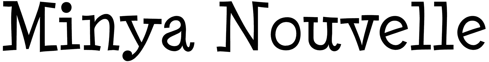
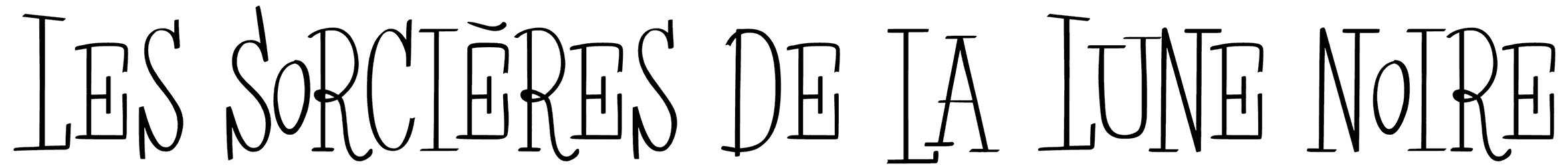
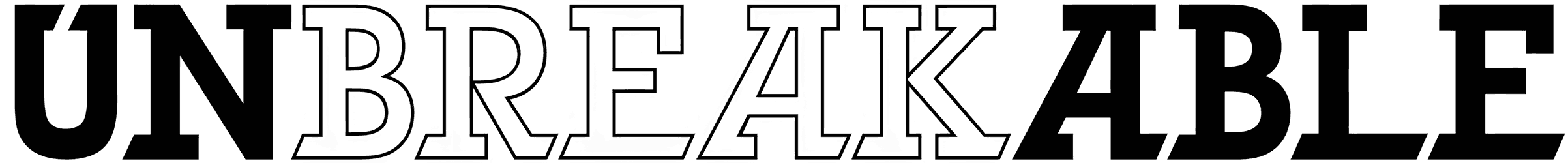
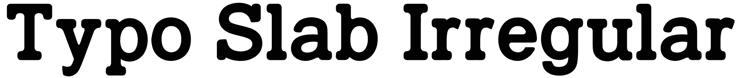
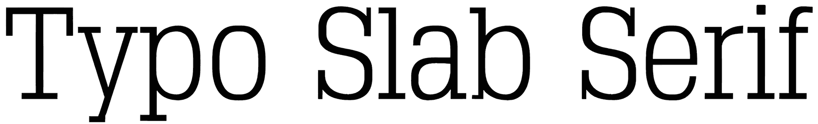
- How do these fonts change the view of your lettering and make it look more interesting? There are plenty of options to decorate your text and get rid of its simplicity. The square serifs, courtesy of slab serif fonts, count as one of the most promising ways to enhance the visual interest of your lettering. That consistent thickness maintains a harmonious look while the block-like letters guide you toward highly readable texts. So you don’t always need only those horizontally extended fonts in this collection to make sure of the legibility. You’re just going to love their geometric letters for the inherent old-school charm that they bestow upon your art. Apparently, their sturdy design features never seem to miss the target.
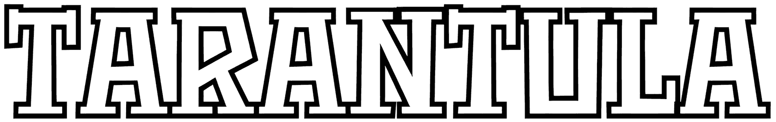
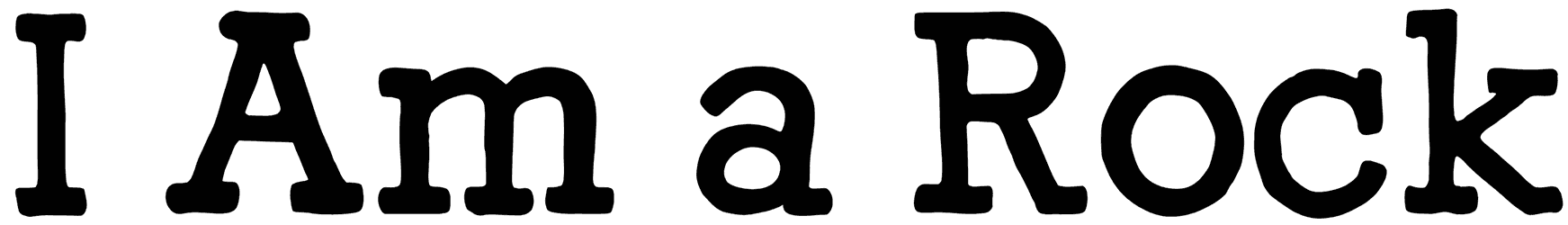
- What is the meaning of slab serif letters being used in a certain design? When a font displays so many robust qualities in its font style as the ones in this collection, you should see its bold character coming too. These slab serif fonts boast a retro touch that is the same as all the other serif fonts. However, just like the rest of them, these fonts are still a great companion for your modern designs. Once you get the hang of it, you should also be able to detect a hint of a Western feel from some of these fonts. There are also occasional Egyptian slab serif fonts radiating ancient vibes. So, even though the fonts in this category can appear in different styles, their strong tone is not something that can be faded.
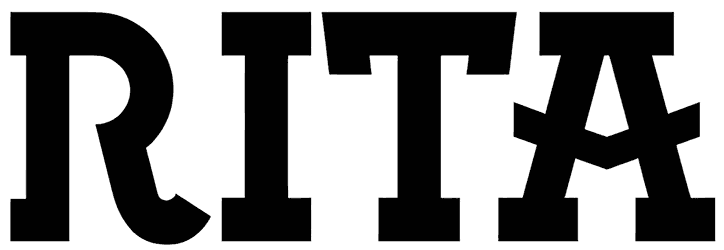
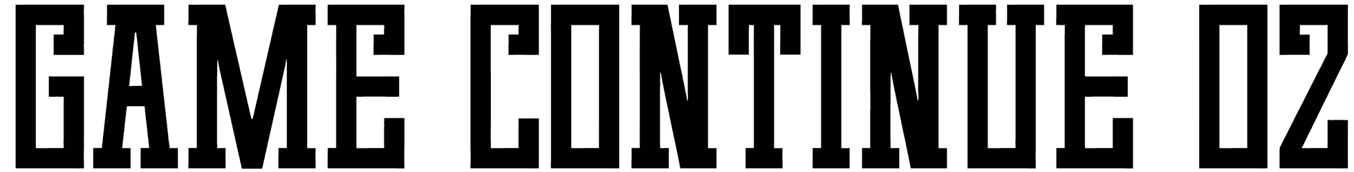
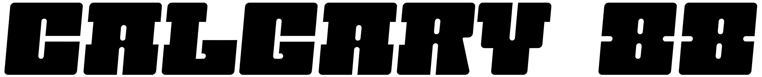
- Where can you rely on slab serif fonts for your typography projects? The benefits of using slab serif letters in your texts are many. So it makes sense that a lot of designers feel compelled to turn to these fonts on several occasions. The most common example of these fonts being used is as headlines for any design you can name. Some other designers seem more interested in using their old-fashioned charm as Google fonts to create website headers, pop-up ads, and digital banners. Also great to be used as a Canva font, these fonts work like magic for designing social media posts and posters. What's more, their timeless spark is something that comes in handy for logos too, as long as it fits the brand's values. Additionally, based on their sports theme, designing professional uniforms for sports teams should be easy using these fonts.
- Don’t you also want to see the rest of Resource Boy’s library as the ultimate font source website? To bring you the widest variety of all, Resource Boy has set out to collect every last premium and free slab serif font out there for you. But this is not our only mission. We’ve also made it possible for you to access the best basic fonts, retro fonts, and basketball fonts here on Resource Boy with ease. In fact, there are hundreds of other font categories to offer you as well, and you can check out every one of them that you want for your typography right now.