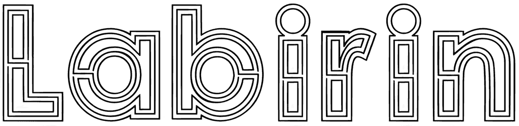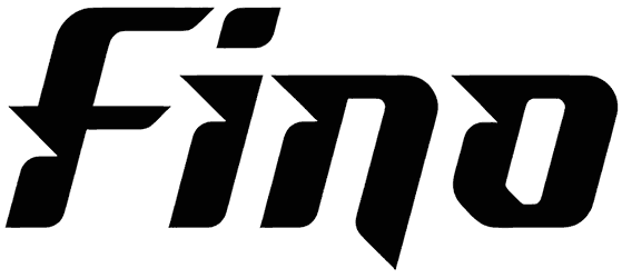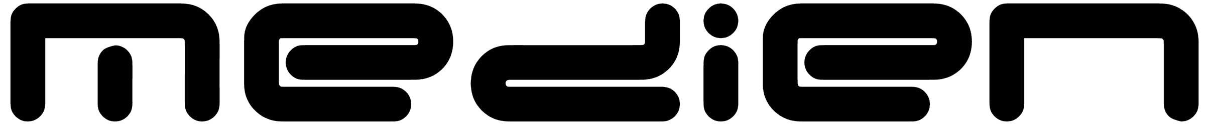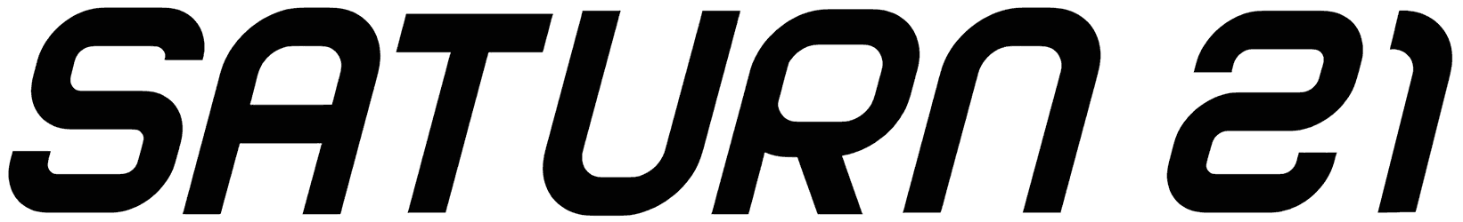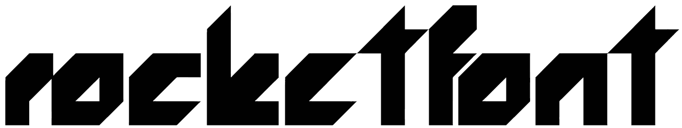
We’re just going to say it once so listen carefully. The mechanical design of Monoscreen may appear a bit harsh and uncozy at first, but it’s gonna be the first thing that ever happened to you and your digital projects, anything at all.
Of course, only the second version of capitals looks like a chipped piece and the other set is perfectly intact. Maybe a combination of both styles is in order for gaming branding and robotic company logos. Thoughts?
Note of Designer
PLEASE READ THIS CAREFULLY :
By installing or using this font, you are agree to the Product Usage Agreement:
– This font is a DEMO VERSION and ONLY allowed for PERSONAL USE. NO COMMERCIAL USE ALLOWED!
– Here is the link to purchase full version and commercial license: https://calligraphyfonts.net/product/monoscreen-modern-font/
– For Corporate use, you have to purchase Corporate license
– If you need a custom license please contact us by email : [email protected]
Please visit our store for more amazing fonts : https://calligraphyfonts.net
Thank you.