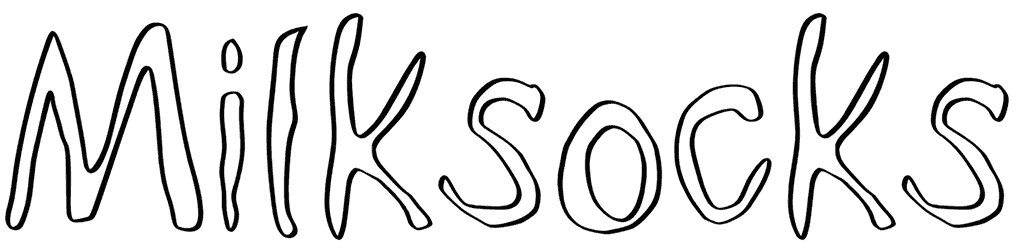
Milksocks font looks like quick pen sketches turned into an alphabet; thin, uneven strokes, doubled contours, and little wobbles that keep the forms intentionally imperfect. The loose construction feels curious and handmade, almost like notes from a sketchbook rather than polished digital lettering. That roughness gives it a quiet personality: quirky, casual, and slightly nostalgic.
It would be fun across zines, illustrated posters, indie packaging, journaling graphics, album art, or playful editorial details. Keep this outline font small for a scribbled accent, or enlarge it until those shaky outlines become the texture itself. Off-white paper, muted ink tones, doodles, and photocopy grain would suit its imperfect charm especially well.
Note of Designer
FONT BY T.INK (2023)
Free for personal use ONLY
For commercial use please contact designer.Donations are highly appreciated!