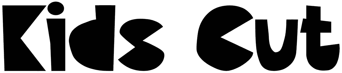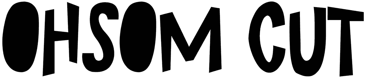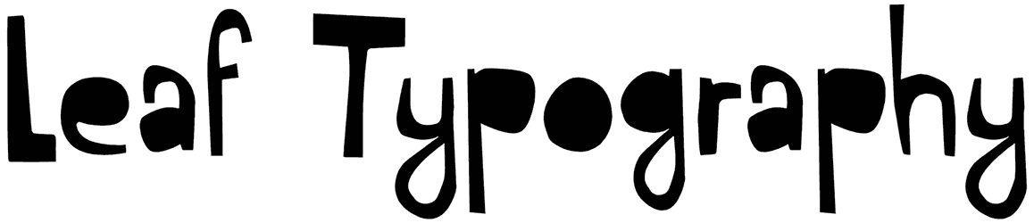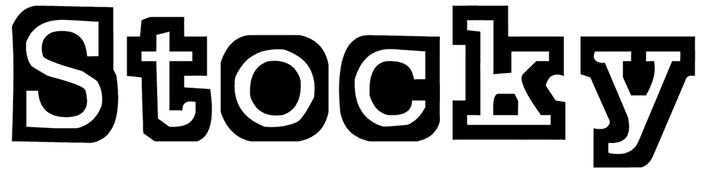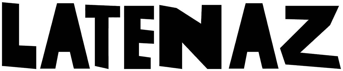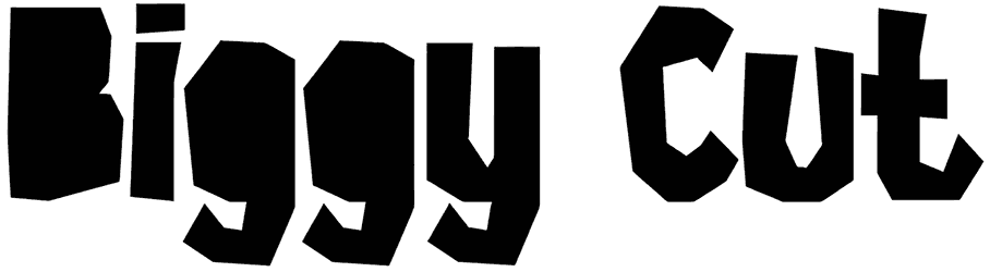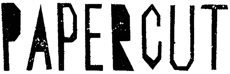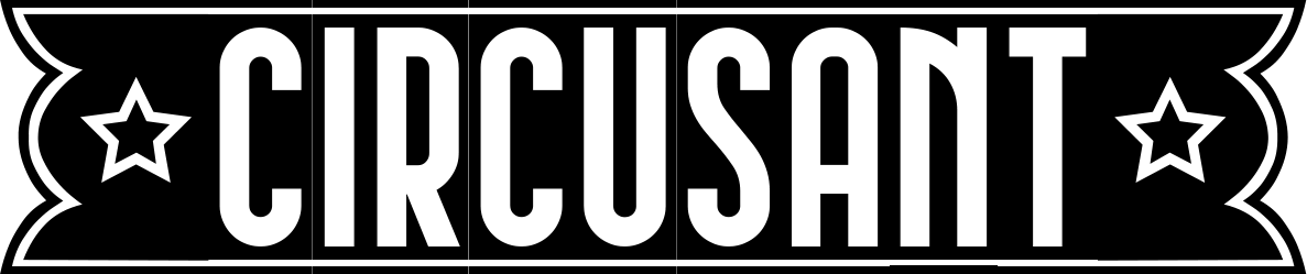

Angular cuts, chunky black shapes, and deliberately awkward proportions make Jokehoror font feel more mischievous than frightening. The forms look almost assembled from paper blocks, with irregular corners and unexpected notches creating a playful, offbeat rhythm. There’s a cartoon energy underneath the rough geometry, so the type lands somewhere between quirky horror graphics and experimental display lettering.
Use that tension on Halloween posters, indie game titles, sticker art, zines, or packaging that needs personality without going full gore. This cut out font can look especially sharp in oversized black type against acid green, orange, or cream; add rough textures or simple illustrations, and the strange silhouettes become part of the artwork.
Note of Designer
100% FREE
for other question please contact
[email protected]