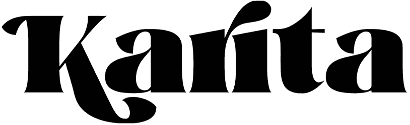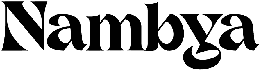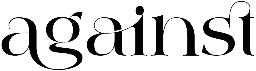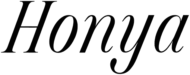

Equilibrium Serif font has the weight of vintage signage but none of the stiffness. Its bold, softly rounded serifs and generous curves give headlines a sturdy, welcoming character, while the balanced proportions keep everything polished. There’s a nostalgic print-shop mood here, especially when the type is allowed to sit large and confidently centered.
A whiskey label, heritage café identity, book cover, apparel badge, restaurant menu, or retro poster would suit this serif font beautifully. Try mustard, charcoal, cream, engraved illustrations, arched text, and subtle paper grain for a finish that feels classic, warm, and carefully built.
Note of Designer
NOTE: This font is for PERSONAL USE ONLY!
To purchase a commercial license, visit:
http://mn.sg/equilibrium-serifEquilibrium Serif’s neo-classic design evokes timelessness, while the glow of its smooth curves adds a warm, inviting touch.
Equilibrium Serif is versatile, lending itself to both formal and modern contexts, making it perfect for projects that require a refined charm.For questions, please visit www.mn.sg/faq