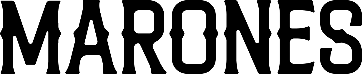
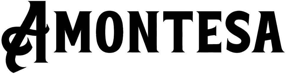
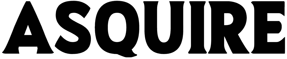
Donrich Sugihpribadi feels rough-cut in the best way, with chunky uppercase forms, uneven edges, and slightly distorted curves that make the alphabet look carved or stamped by hand. Its bold silhouettes stay highly readable, while the irregular contours bring in a gritty DIY personality without pushing the texture too far.
Use this indie font for poster headlines, streetwear graphics, music artwork, packaging, stickers, or rugged branding. Let the letters run large and pair them with grain, photocopy textures, or simple blocks of color. Black, off-white, red, or muted earth tones can reinforce the raw print character while keeping the overall composition punchy.