To be fair, no one is paying enough attention to diner fonts these days, but they don’t know what they’re missing. After all, there was a reason they were so popular back in the fifties. That kind of pleasant simplicity doesn’t just go away in only a few decades. Professionally speaking, the time is ripe for the rest of the world to start appreciating diner fonts like New York City and Las Vegas do. Last time we checked, finding the best diner typefaces on Google used to be a real pain in the back. Now, we’re glad to say we’ve made sure it’s never going to be even half as hard. It took a few years but Resource Boy can finally provide you with the ultimate selection of diner characters that you can never find elsewhere. The engaging previews, the detailed character map, and the professional download tips are why you should get all your fonts from the RB website. So let’s get going right now.
Who’s up for a tasty dish of diner fonts? Resource Boy has set the table already, so help yourselves!
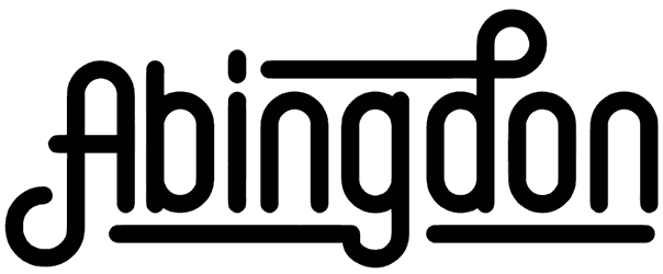
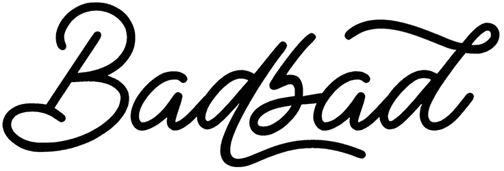
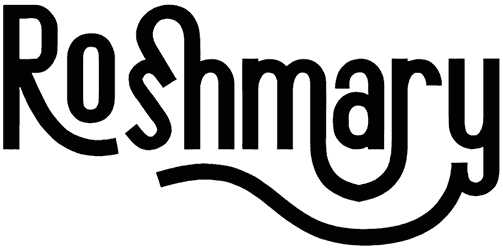
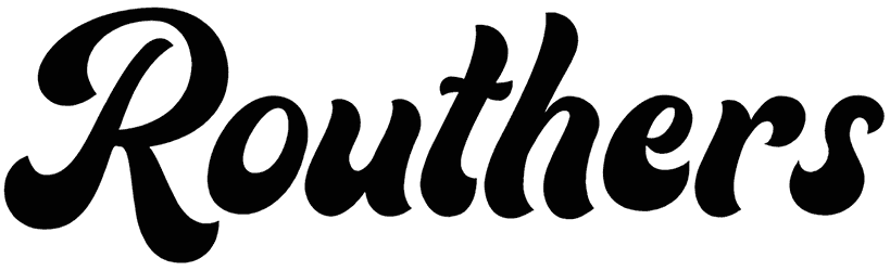
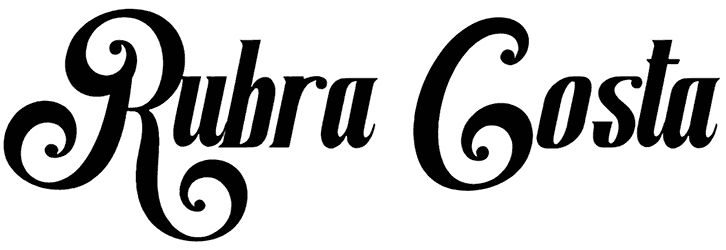
- Don’t you want to know what diner fonts look like before you apply them to your writing? At first, it might seem like diner letters don’t follow any specific rule in their design. However, once you see the pattern, you’ll bond more closely with them. But if you do have a little previous knowledge about them, chances are, it’s mostly thanks to their big classic letters that give you the hint and make you say “So, this is probably one of those good old diner typefaces”. But here’s another detail that can tip you off. These fonts are also known for their nice casual vibes, and what better way to capture that than a script style that is always in the flow? The hand lettering makes the communication a lot more personal, as it was previously used to invite people into a cozy little diner for a delicious meal, and now, for anything you can think of. Don’t let their cursive format cause you any worries though. It’s not going to get in the way of your message being fully understood by the crowd. Instead, it helps your text get the attention it deserves. For that, sometimes they rely on a country style to get there, and some other times, a bunch of playful cartoon letters are a better choice.
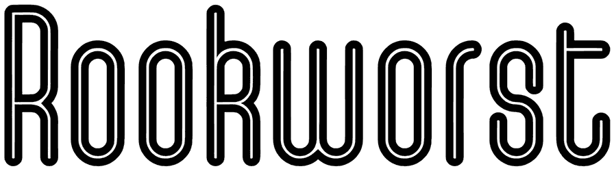
- Here are all the flavors on the menu when you let a diner font take charge. Greek, Indian, French, or Japanese, all of these languages are going to feel the same as English words every time you decide to use one of these fonts. Also known as American diner fonts, they introduce your lettering to a sweet mid-century style that always sticks out. Even though they are preferably customized in not the strongest colors, these retro diner characters don’t always have to be displayed in faded textures. That's because you don’t see many old-fashioned fonts express such a sparkly personality. So that makes our lovely fonts one of the few. Rooted in the famous art deco style, the diner alphabet is not just based on vintage features. It’s through the combination of a nostalgic bold and curvy style, and the clean streamlined characters from the recent era that diner fonts look so ageless. As one of the 50s fonts, these fonts are supposed to represent the transformation of the past to the future. Pretty much like a double agent, fontdiners are supposed to lend their retro flair to your art but instead, a subtle modern note is also implemented by their sleek letters before you know it.
- In case you don’t know, diner fonts are not just about promoting a diner. The way this category of fonts is named leaves little doubt about how perfect they are in all restaurant-related designs, from the signage to the menu, and the food packaging. But you probably shouldn’t use the same kind of fonts on all of them. You need a different style of dinner font with suitable weight, height, and curves for each of these purposes and you can find them all somewhere around our collection. But are these 50s fonts only great in restaurant signs and not for other stores? Don’t think so. They’re not going to be any less eye-catching as stationery store signs than they are as cafés signboards. Once you download and work with at least a couple of these retro diner fonts from RB, you’ll see how awesome they are for designing logos, decorating rockabilly album covers, coming up with unique apparel labels, and so on. Basically, all names shine brighter once diner letters enter the game and lend it a friendly tone. So all in all, it shouldn’t be hard to give your advertising strategies a push now that you can quickly access a whole bundle of diner typefaces straight from Resource Boy.
- What other kinds of graphic design supplies do you want to order next once you’re done with these fonts here? RB’s diner pack is so extensive and first-rate that downloading just one or two of these fonts is never going to be enough for anyone. Go through the whole collection, one font at a time, and add lots of new interesting items to your personal font arsenal at once. Plus, we have so many other tasteful offers for you on RB that you can never imagine. Let’s begin with super inviting casino fonts and neon fonts that are probably the more recent versions of diner fonts with slightly stronger modern traits. Then comes the rest of our retro fonts, starting with the closest option to diner fonts, the all-time favorite retro 1950s fonts, then the 80s and the 90s fonts. By choosing these fun nostalgic fonts for your next typography, the good old days of the 1900s will be back once again with your single click for you to relive the memories. So with all these cool features that you have to try, you better not lose another second and start exploring the Resource Boy library straight away.