You won’t believe how easy it can be to design something more distinct than your usual texts. You just have to replace every letter with its capital version and you’ll be good to go. It seems like such a simple solution to create something so highly effective, but that’s just how it is. Now that you’ve been lucky enough to discover the world’s best capital font collection here on Resource Boy, you’re going to be unstoppable. You’ll have all these bold options in front of you to make the strongest impact on your viewers. Just click the download and the font itself will take care of the rest.
Sure enough, there’s still more to know about our all caps fonts:
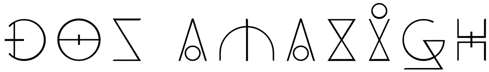
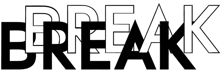
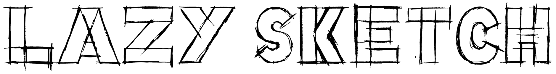
- What are the most important traits of this font style? The legibility of your writing is the last thing you should worry about when you choose to go with an all-caps font. Every letter will be so obvious that you’ll find no one complaining about your text not being easy enough to read. That’s what you get when all the characters in your lettering belong to capitals. Usually, all the letters of each font are designed in the same size. So it’s pretty much going to lose its touch if it's used for long body copy. That just wouldn’t be visually interesting anymore, unless at least you find a font with the first letter of each word bigger than the rest. Besides that, there may be a few misunderstandings about this font category though. To clarify, let’s just say not all of them are designed as sans-serif fonts, even though that seems to be pretty common around here. Secondly, it may sound a bit surprising but these capital fonts can be in calligraphy too. That probably goes against the individual arrangement of letters that we expect from them by default. Furthermore, just like any other font, the density of the characters is quite flexible, going all the way from skinny to thick letters. All in all, you could say these fonts strike the perfect middle ground between a decorative touch and a neat appearance.
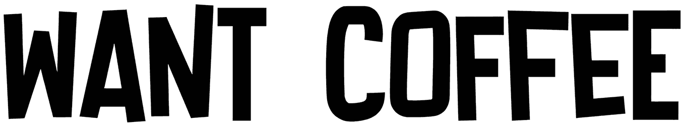
- What kind of emotions do they add to the background? Basically, anything sounds louder in the all-caps letters. The message is straightforward and it’ll be expressed confidently. Therefore, it’ll imply a sense of importance. If that doesn’t give you the full attention of the audience, nothing else will. Most of the time, they will lend a masculine touch to your words, making them suitable for any sports or military designs. However, don’t take that to mean they’re only made for formal themes and demonstrating a tough attitude. No! The authority in their tone can be adjusted based on whether they’re in handwriting or not, or the use of elegant details in their style. If you think all of them come with a solid character, just wait to see a cute one. Of course, they will be just as powerful in reaching out to the audience though. Plus, they shouldn't be considered exclusive to either modern or vintage themes, while they can nail both so flawlessly.
- When wouldn’t you want to miss your chance of using uppercase fonts? If your next typography project involves designing a monogram, gym logo, soccer match flyer, or title for banners and magazines, the all-caps alphabet hits the spot. Just keep in mind that it only works best when you have a short message to get across. So try to be as brief as possible if you want your letters to count.
- What comes next when you’re done with this collection of RB? Judging by the magnitude of our library, our list of resources goes on and on. However, we suggest that you visit our small caps font collection after this. You'll love it!