![]()
![]()
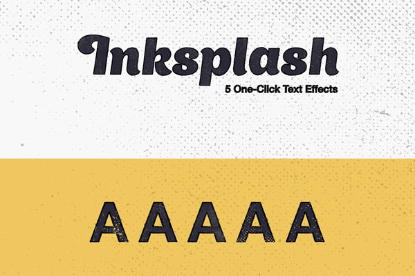
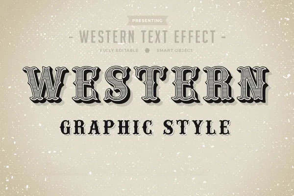
Vintage stamp effects have a way of making modern designs feel like they’ve lived through something. That’s what we liked most when experimenting with this one. Instead of looking artificially distressed, the texture creates the kind of imperfect print quality you’d expect from old packaging, archival documents, or worn labels discovered years later.
It works especially well on branding projects that need history, character, or a handcrafted feel without becoming overly decorative. Posters, coffee packaging, apparel graphics, and editorial titles instantly gain more personality through the subtle ink imperfections. Sometimes the missing perfection is exactly what makes typography feel believable.