![]()
![]()
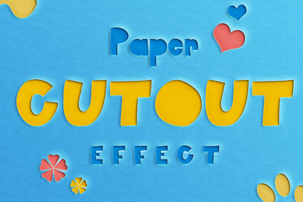
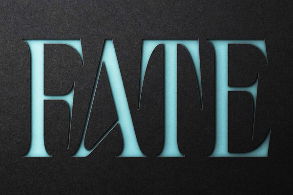
Carved like layers of handmade paper suspended in midair, this papercut text effect turns typography into a tactile experiment. The shadows feel sculpted rather than generated, creating a dimensional illusion that instantly pulls attention toward the composition. We’d use it when a design needs warmth without losing graphic precision, editorial covers, playful branding systems, poster concepts, or children’s visuals suddenly gain a crafted personality.
What makes this cut out text effect exciting is the balance between softness and structure: every curve feels cut by hand, while the layered depth keeps the result contemporary. It’s less about decoration and more about transforming ordinary text into physical storytelling.