![]()
![]()
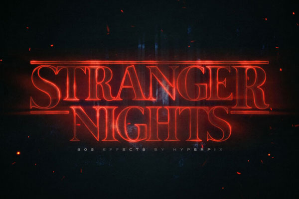
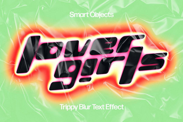
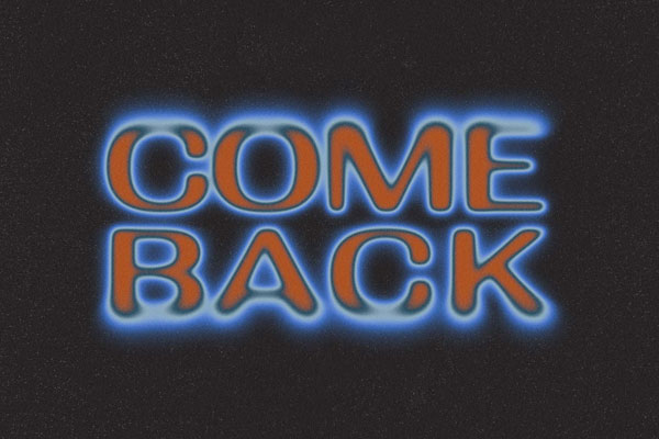
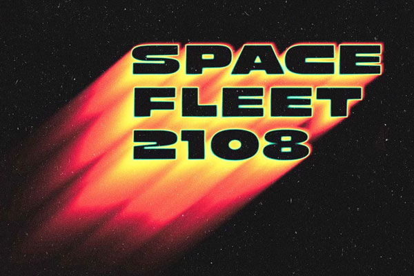
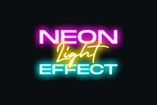
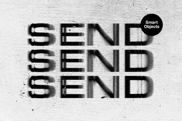
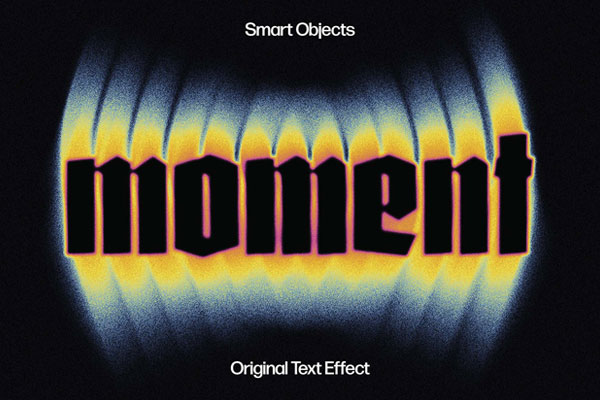
Echo effects are interesting because they can make typography feel bigger without actually making it larger. That’s exactly what’s happening here. The repeated signal trails create the illusion of motion, depth, and sound all at once, which gives even simple words a surprising amount of energy.
It feels like something pulled straight from old broadcast graphics, sci-fi interfaces, or experimental music visuals. Posters, album covers, gaming artwork, event branding, and digital campaigns all benefit from that kind of movement. The best part is that the text still remains readable underneath the distortion. It feels loud, but not completely out of control.