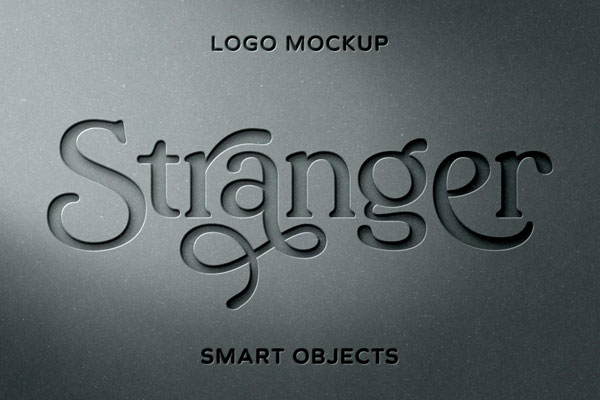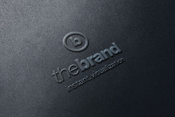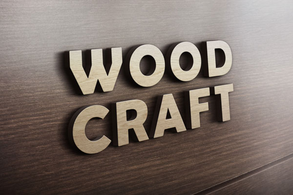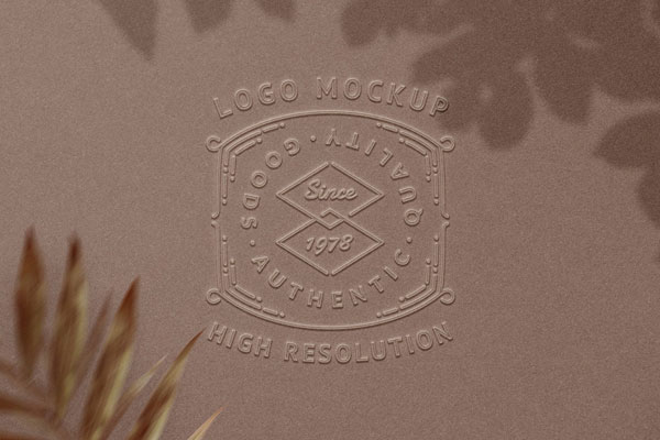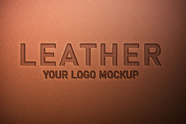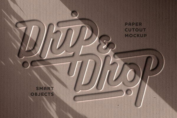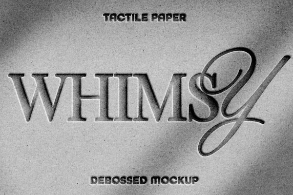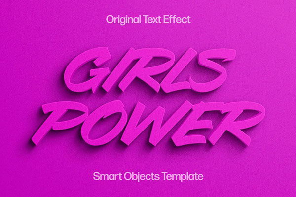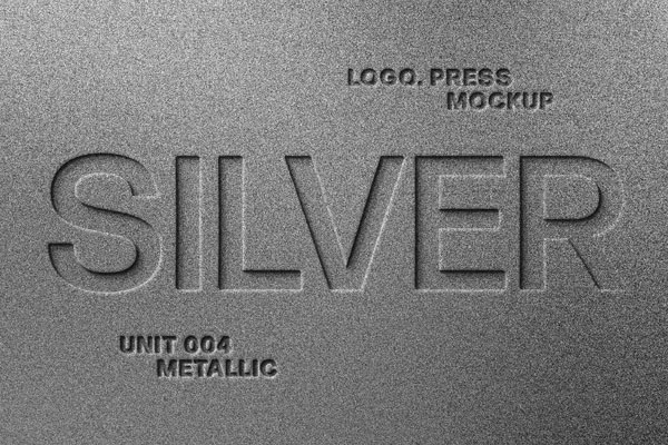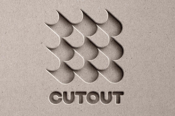
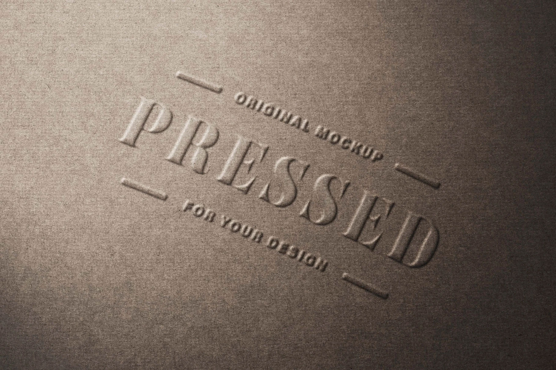
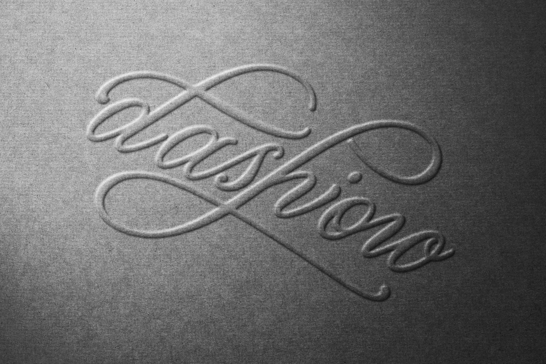
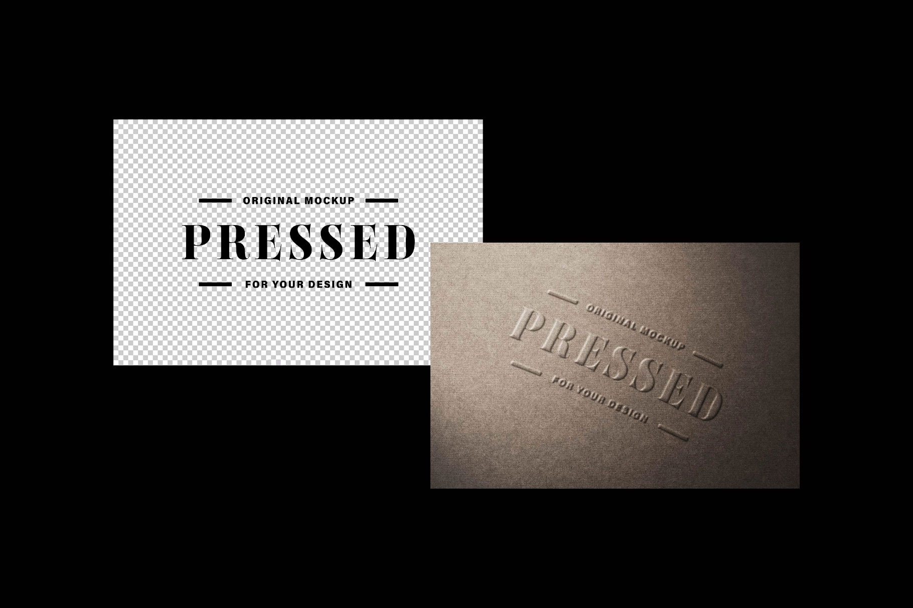
Pressed paper logo mockups are brutally honest. They remove almost everything designers usually rely on, color palettes, gradients, lighting tricks, and decorative effects, and leave only the logo itself. That’s exactly why they’re so valuable. When a mark is physically pressed into paper, every curve, proportion, and detail has to justify its existence. Weak logos feel complicated. Strong logos feel inevitable. This mockup captures that test perfectly, using subtle depth and natural shadows to simulate the tactile quality of premium print finishes.
Corporate identities, luxury brands, stationery systems, editorial projects, and packaging concepts all benefit from seeing whether a logo can stand on its own without visual assistance. Sometimes the strongest branding proof isn’t what you add. It’s what remains when everything else is removed.