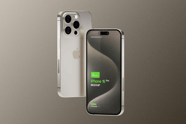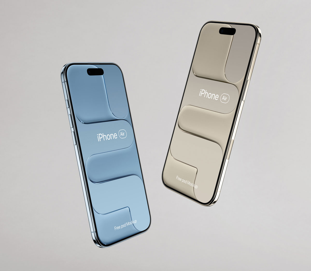
iPhone Air mockups are tricky because they have to feel modern without distracting from the actual design you’re showcasing. Lots of device mockups end up stealing attention with dramatic shadows, complex angles, or over‑styled setups, which can make even great UI or branding feel less impressive. This one feels refreshingly honest. The clean presentation and balanced perspective put your screens front and center, making it easier to judge whether your interface, website, or app layout actually works in a real‑world context.
Startups, portfolios, landing pages, dashboards, and mobile experiences all benefit from that kind of clarity. Sometimes less styling makes the design look stronger because the screen has to earn its presence.