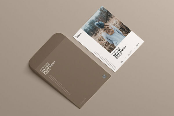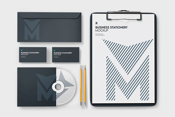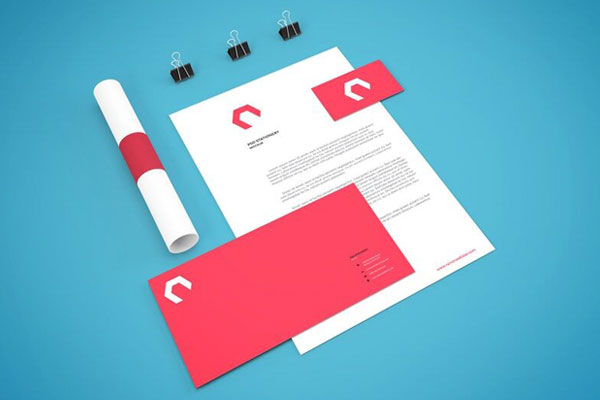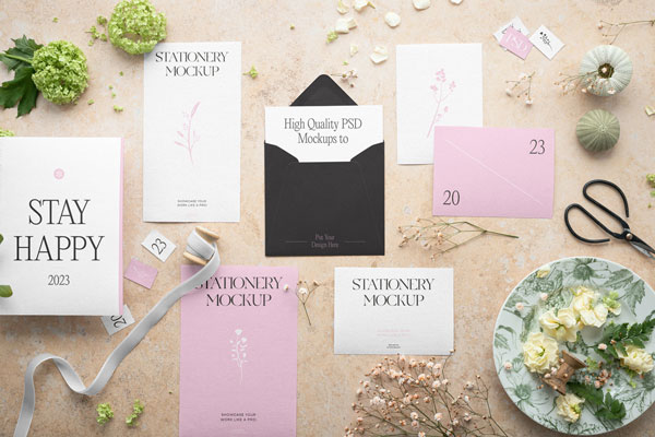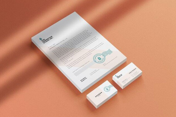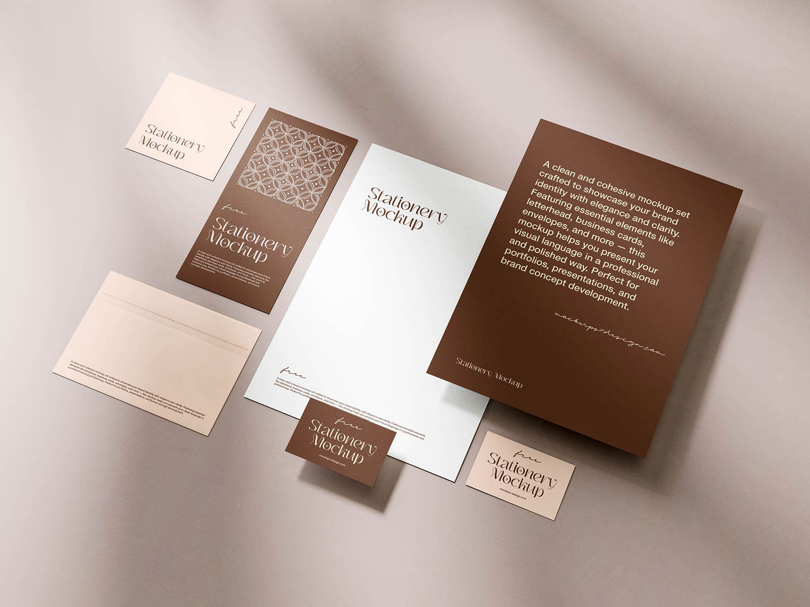
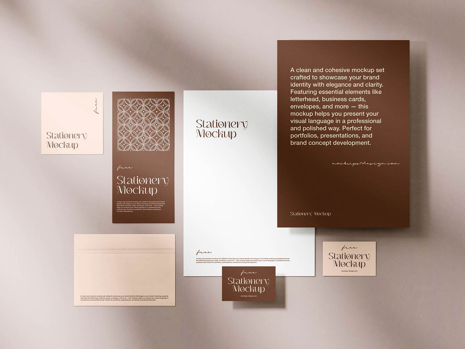
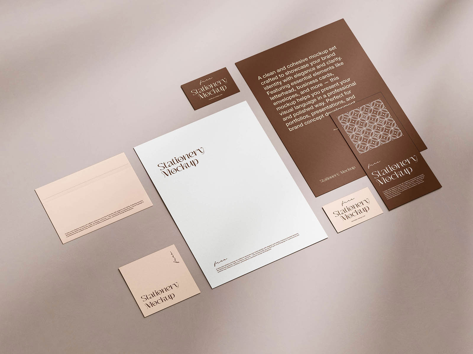
Stationery mockups are sneaky; they make refined designs feel effortless or expose subtle flaws that didn’t show up on the artboard. That’s exactly why this elegant stationery scene feels more useful than a plain paper presentation. The way the items are arranged gives each piece its own presence, yet still feels like part of a unified identity system. Not just logos, but how they interact with hierarchy, spacing, and material texture become instantly more visible.
Corporate branding, luxury identities, premium business systems, and boutique stationery sets all benefit from seeing whether the design feels complete as a “suite” of pieces, not just isolated elements.