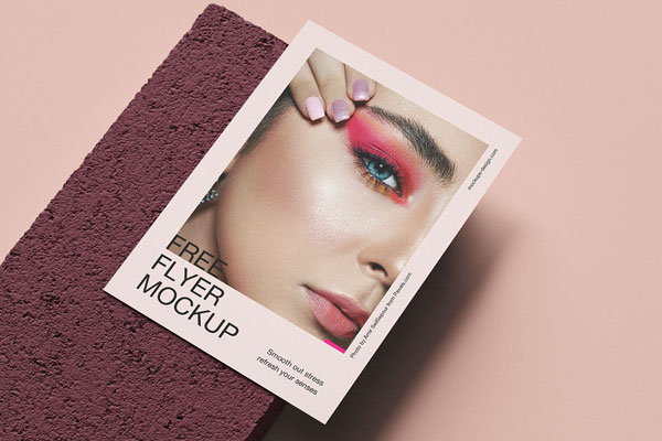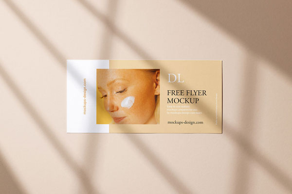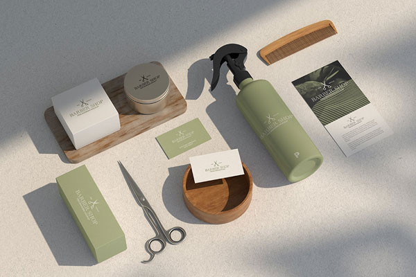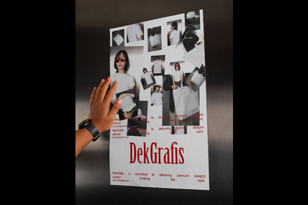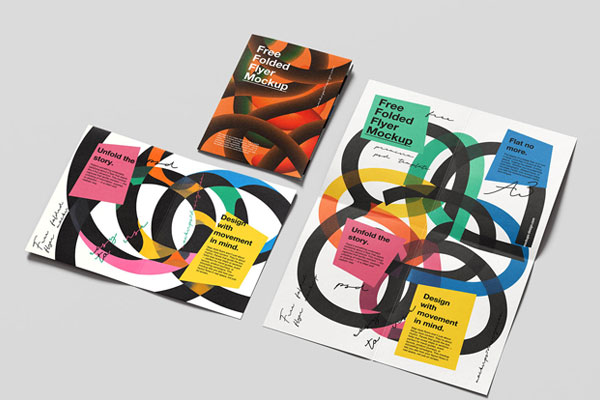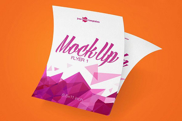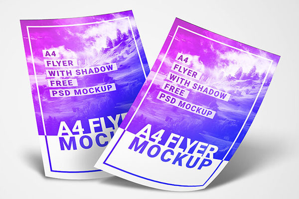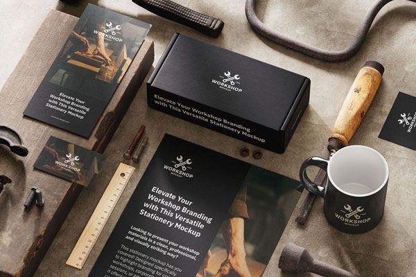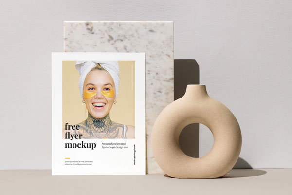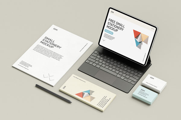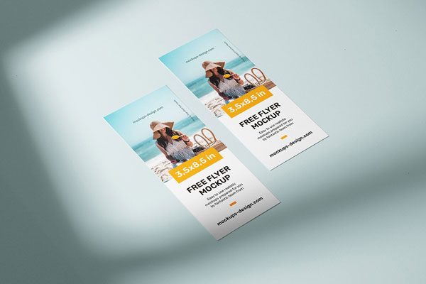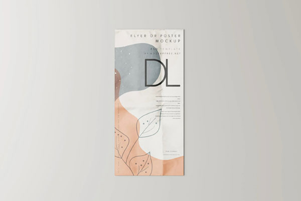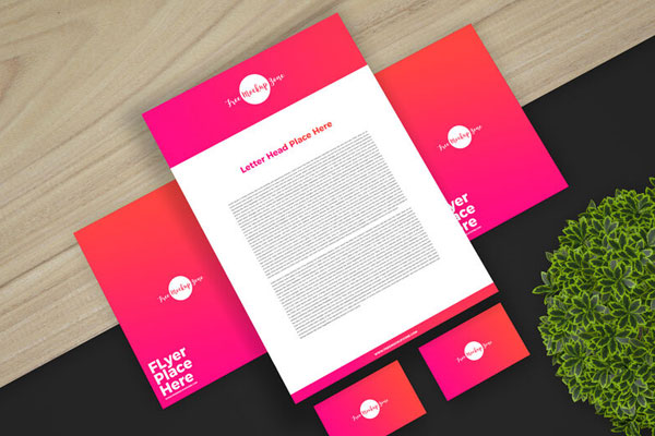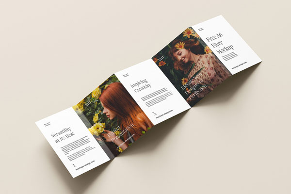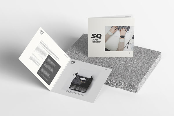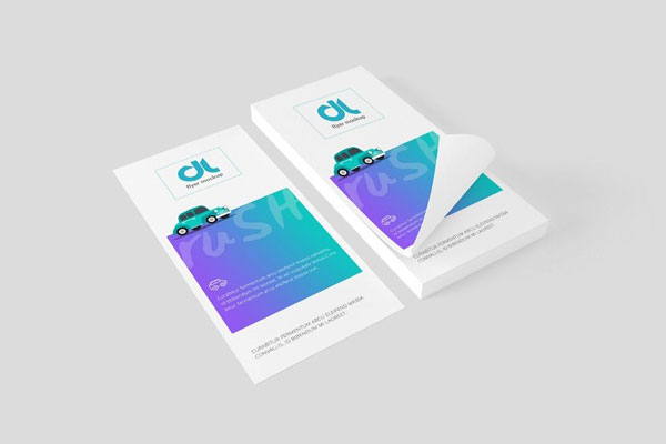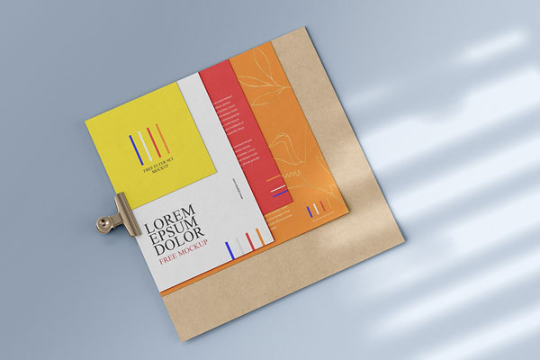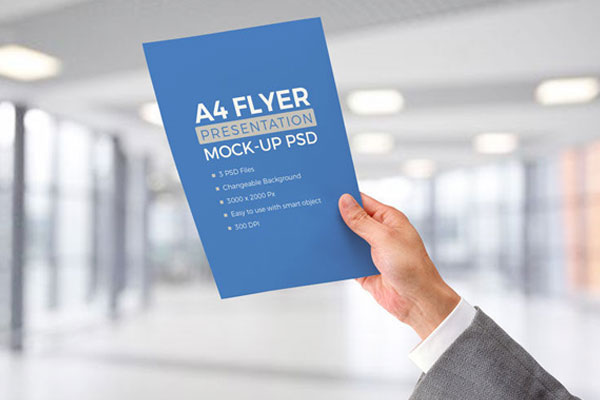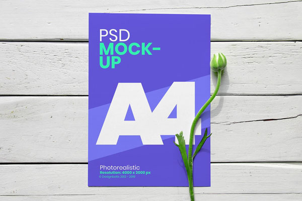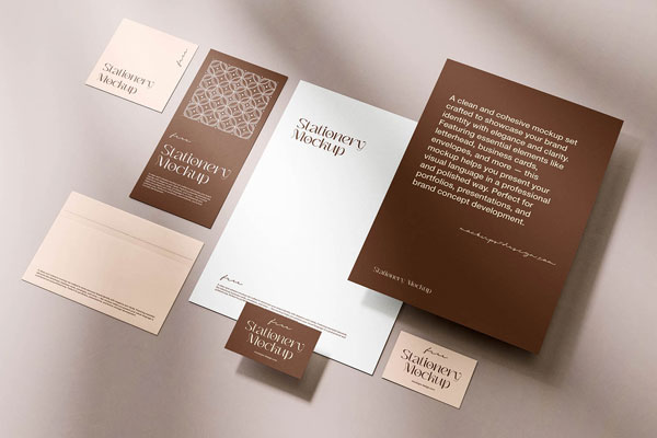
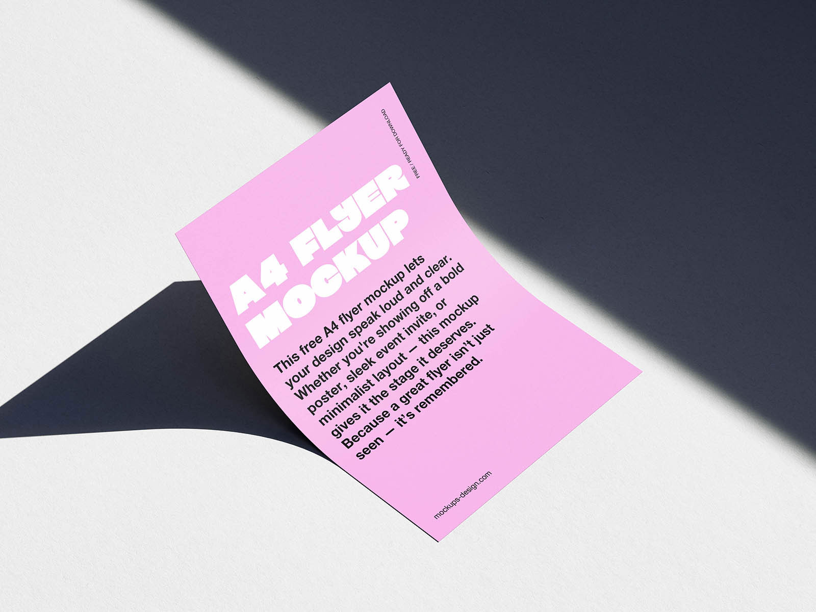
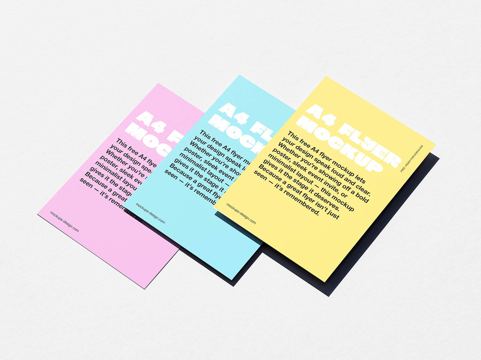
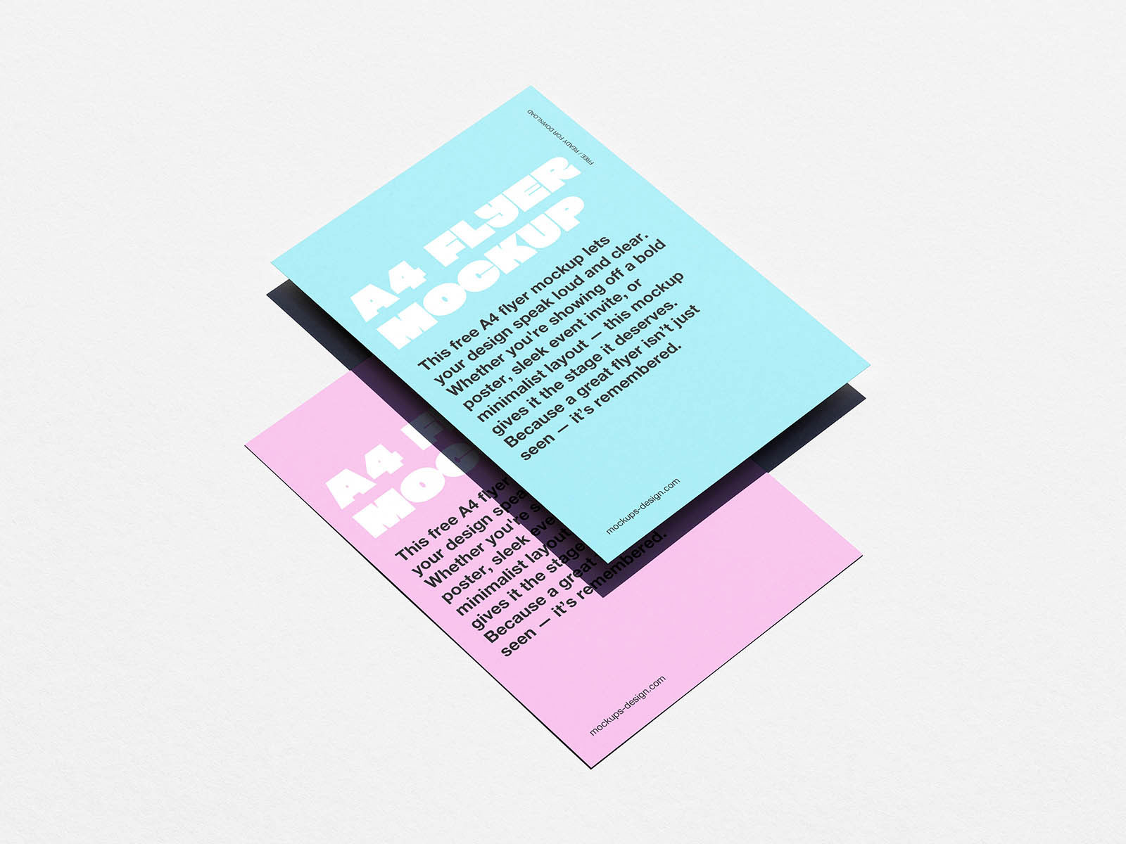
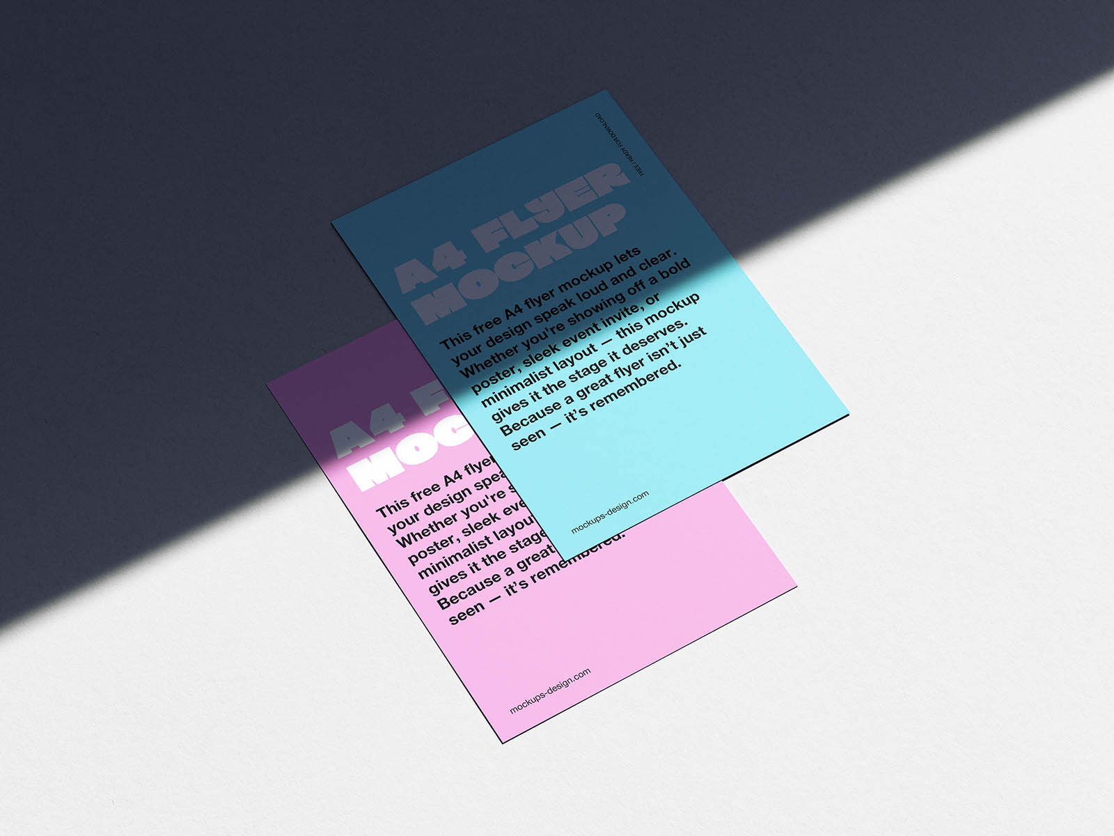
Flyers are one of the first real‑world moments where design meets use. On a screen, a layout can feel balanced, elegant, and intentional, but once you translate it to a printed A4 format and hold it, every detail becomes more honest. That’s exactly why this minimal A4 flyer mockup is such a practical tool. The clean, distraction‑free presentation lets you focus entirely on hierarchy, spacing, typography, and messaging, just as readers will when they pick it up.
Event announcements, restaurant promotions, product introductions, open‑house invites, and local campaigns all benefit from seeing whether the design still feels right when it’s meant to be read at a glance. Sometimes the true test of a flyer isn’t how pretty it looks on your screen; it’s how quickly people get it in their hands.