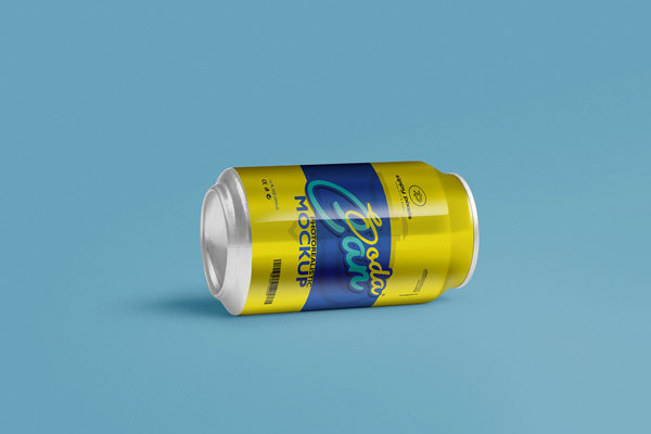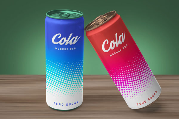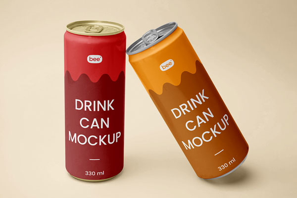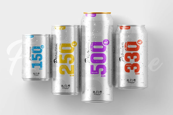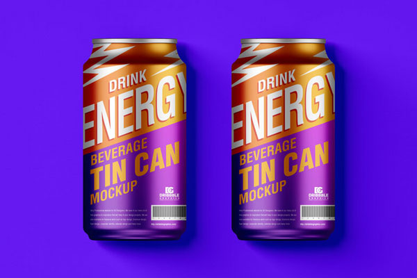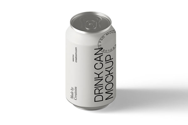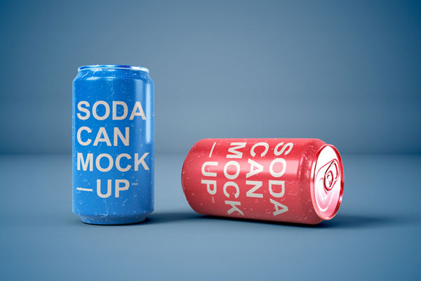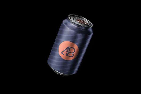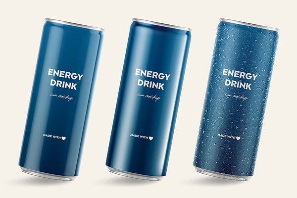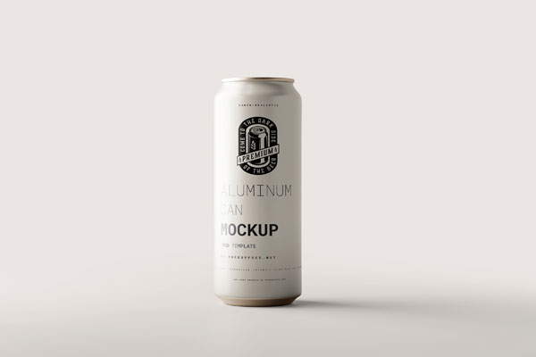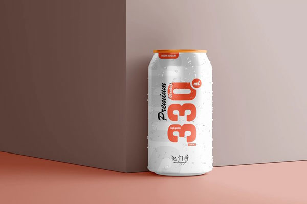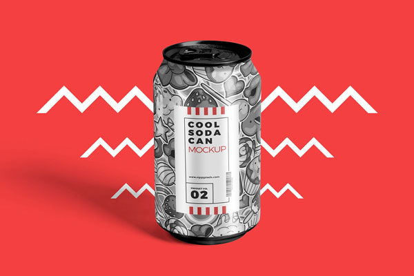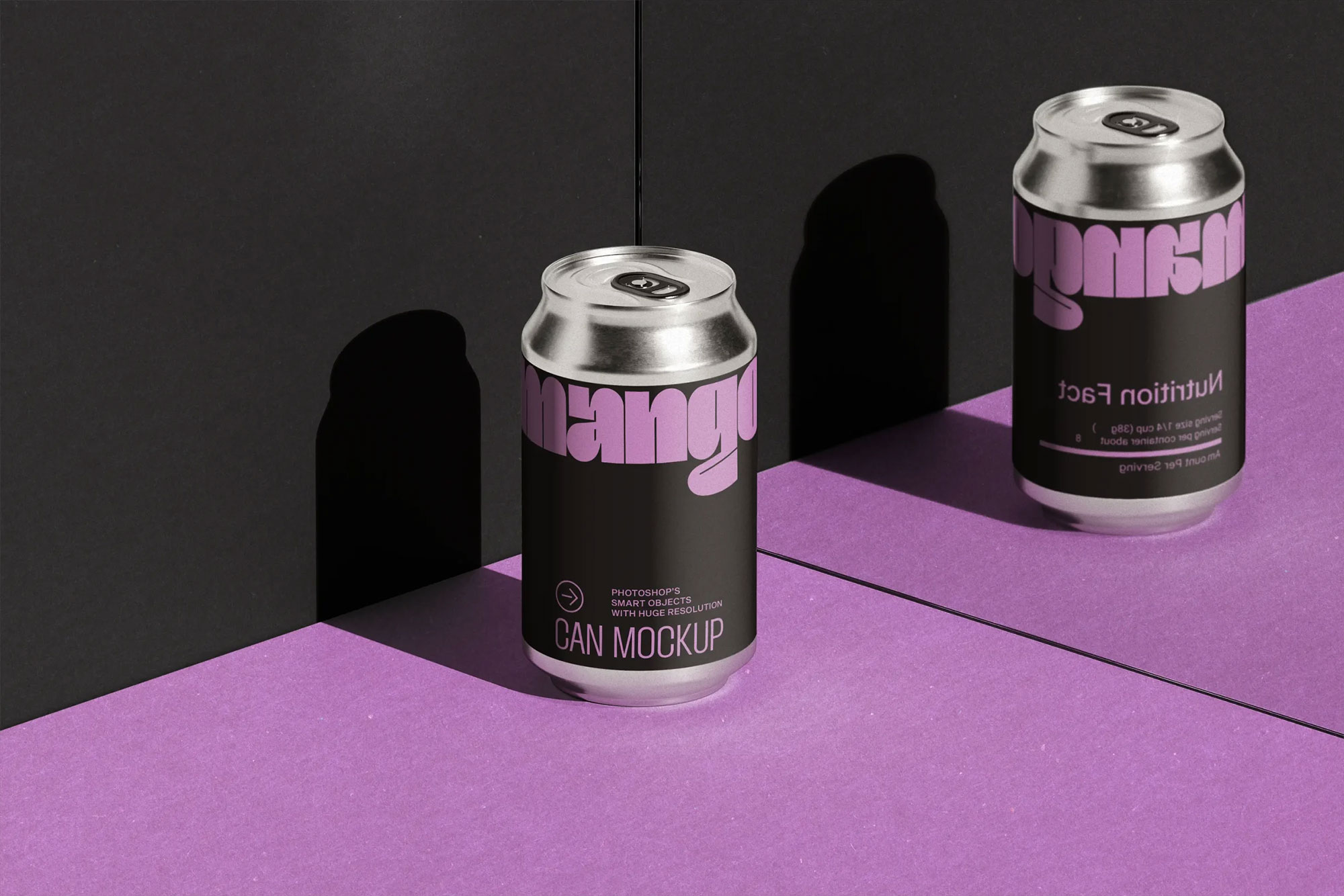
Beverage can designs have an unfair challenge. They’re expected to stand out in a refrigerator packed with competing colors, logos, and packaging styles, all while wrapping around a curved metal surface that changes how the artwork is perceived. That’s why mockups like this are so valuable. The isometric angle and mirrored reflection instantly make the design feel more like a real product and less like a flat label.
Energy drinks, craft sodas, sparkling water brands, canned cocktails, and promotional packaging concepts all benefit from that perspective. Sometimes the quickest way to judge a package is to see whether it still feels desirable when it starts behaving like a product.