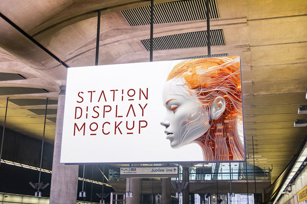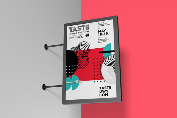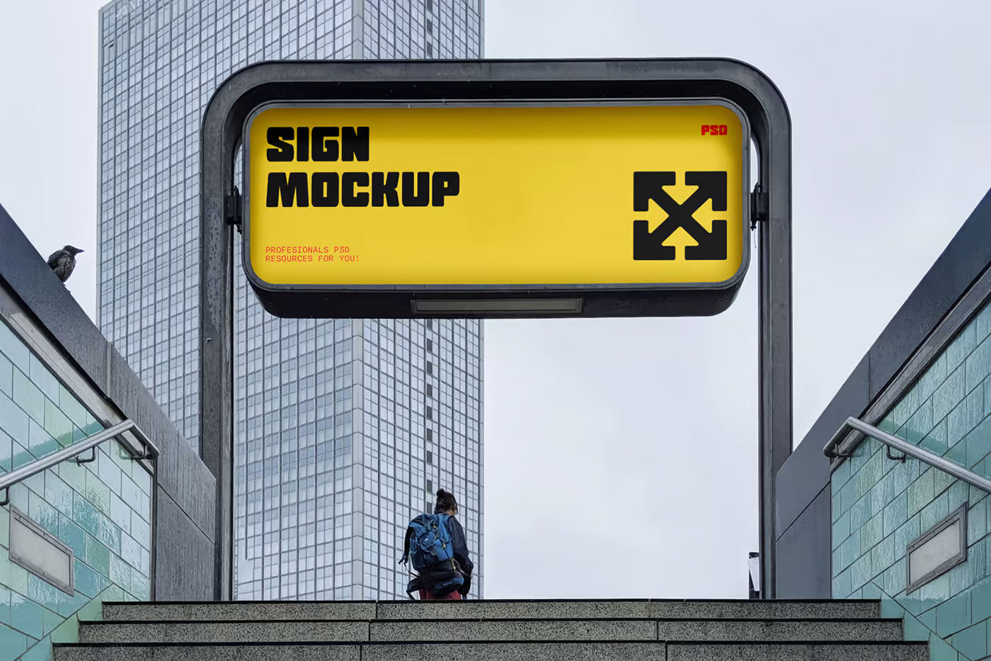
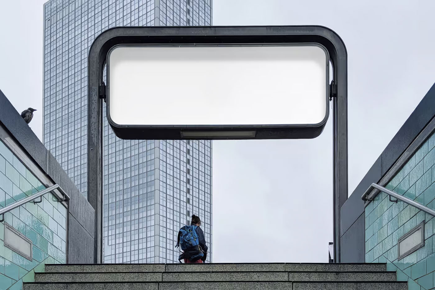
Subway signage feels like the ultimate branding quick‑check. People aren’t standing still. They’re rushing for trains, reading schedules, juggling bags, and thinking about anything but your design, and yet you still need to interrupt that flow long enough for a message to land. That’s exactly why this mockup works so well.
The real‑world context forces you to see whether the hierarchy, contrast, and visual momentum of your design actually hold up under pressure. Transit ads, event promotions, cultural campaigns, urban branding, and product launches all benefit from that kind of honest evaluation. If something still clicks in a subway rush, it’s probably stronger than you think.