![]()
![]()
![]()
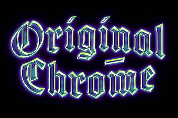
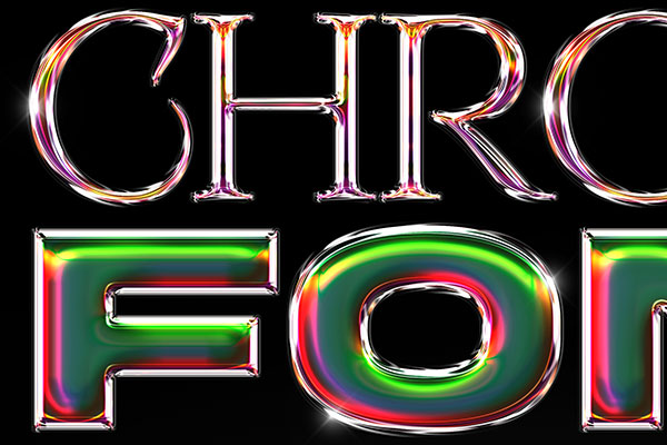
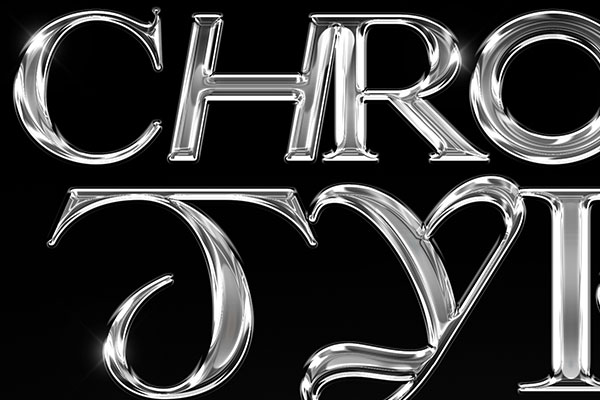
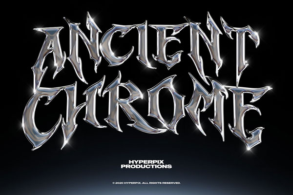
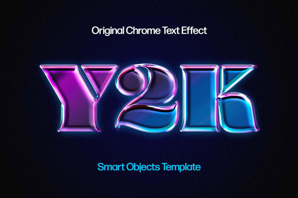
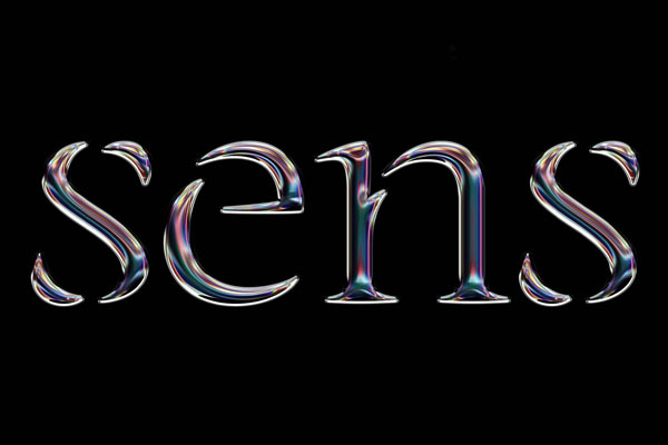
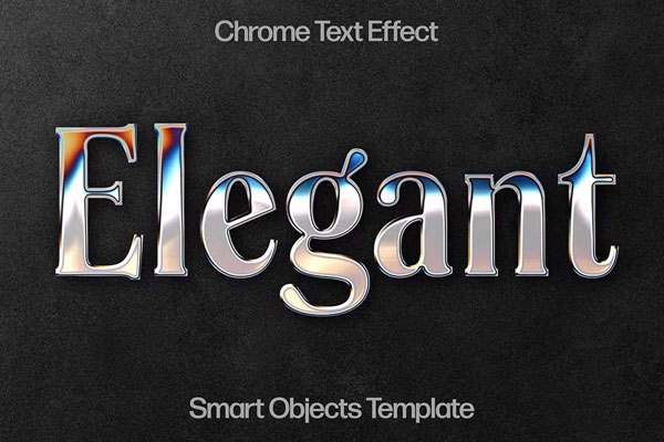
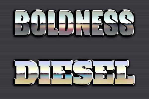
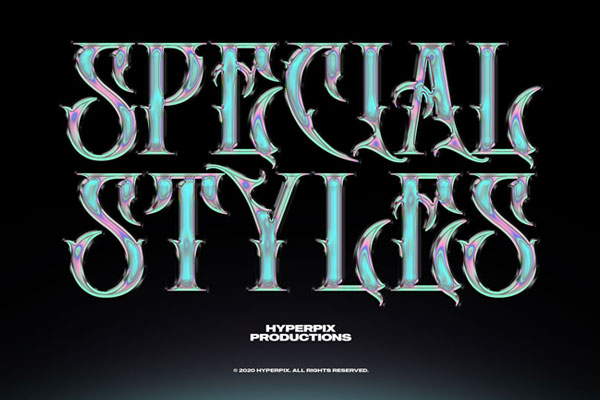
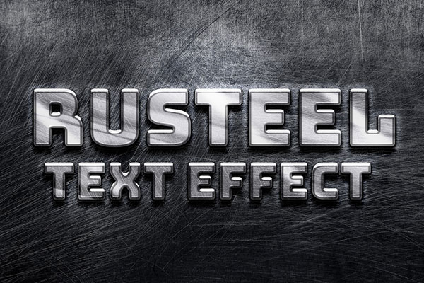
Chrome text effects have been around forever, which is probably why most of them stopped feeling exciting years ago. The problem isn’t the chrome itself. It’s that everything starts looking like the same shiny metallic logo copied from old tutorials. This effect feels different because the lighting does most of the heavy lifting.
The luminous reflections create that oversized, futuristic presence without turning the typography into a visual mess. If you’re designing gaming logos, music artwork, tech branding, YouTube banners, or retro-futuristic posters, this is the kind of effect that instantly makes text feel more expensive. Sometimes brightness is less about glow and more about confidence.