![]()
![]()
![]()
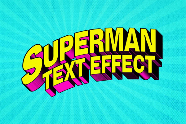
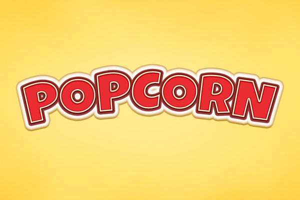
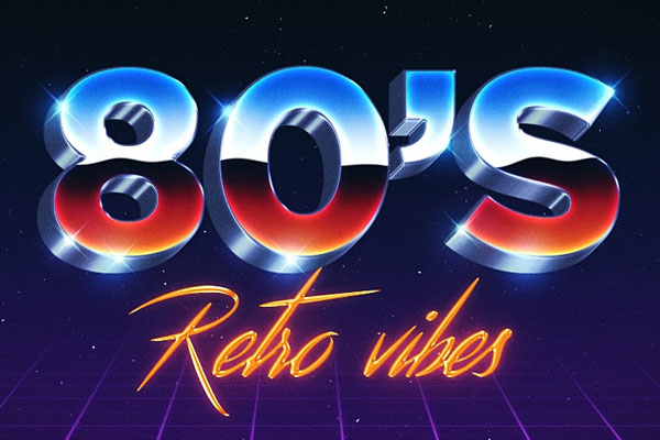
Comic-style typography is one of those things that looks easy until you actually try to make it feel exciting. Most designs end up looking like random colorful text with a couple of outlines slapped on top. This effect gets much closer to the energy people remember from vintage comic covers. The bold shadows, exaggerated depth, and playful color treatment instantly make headlines feel louder without needing extra illustrations to carry the composition.
If you’re working on posters, YouTube thumbnails, merch graphics, event promotions, or pop-art-inspired branding, this retro text effect is the kind of effect that helps the typography become part of the entertainment instead of just introducing it.