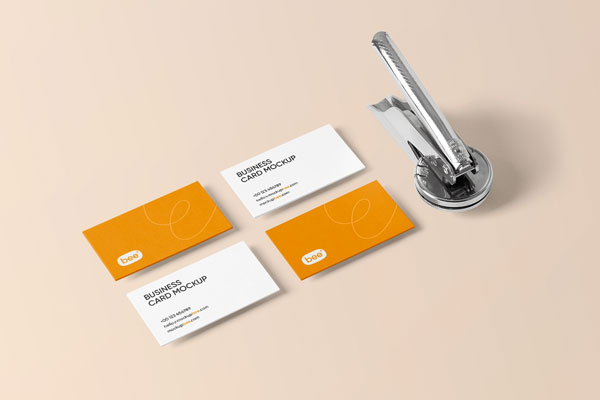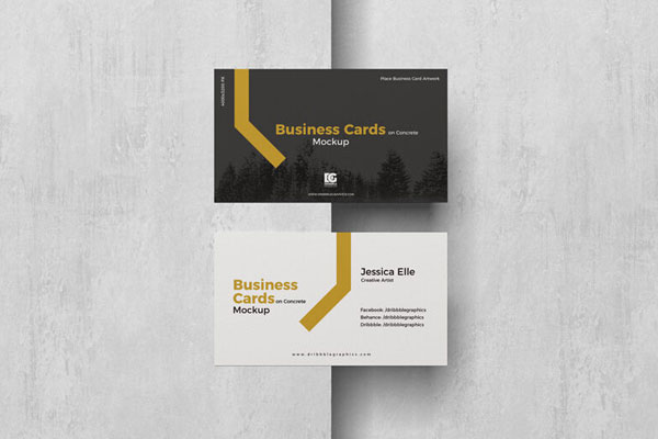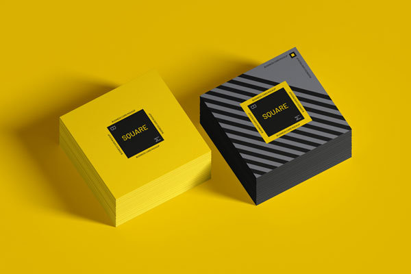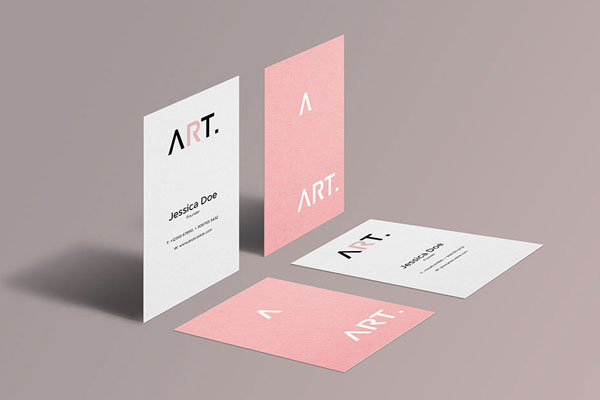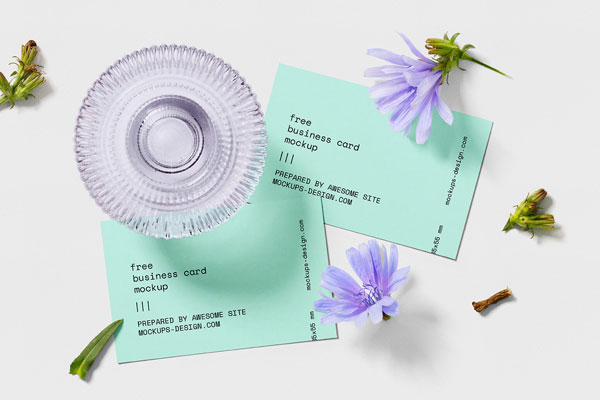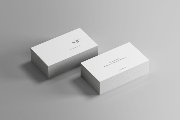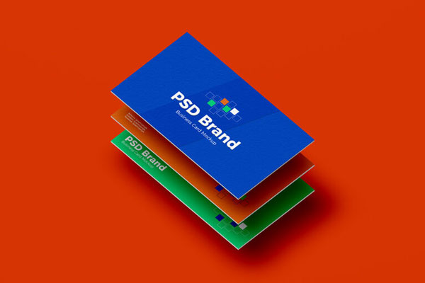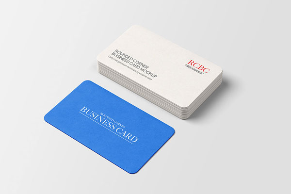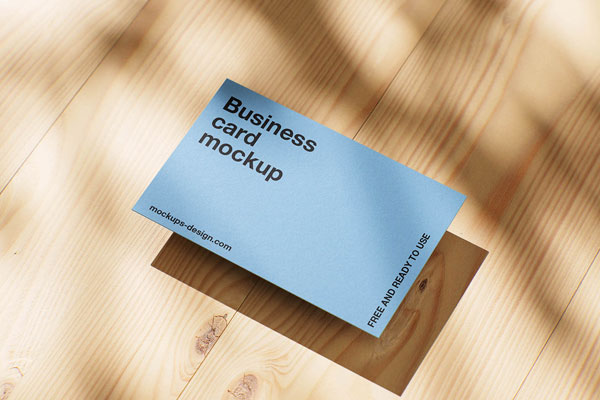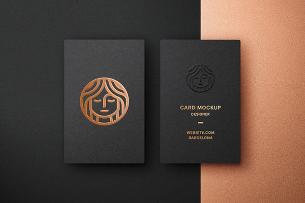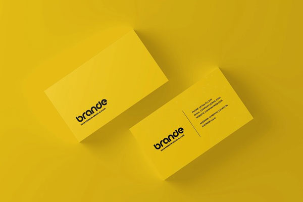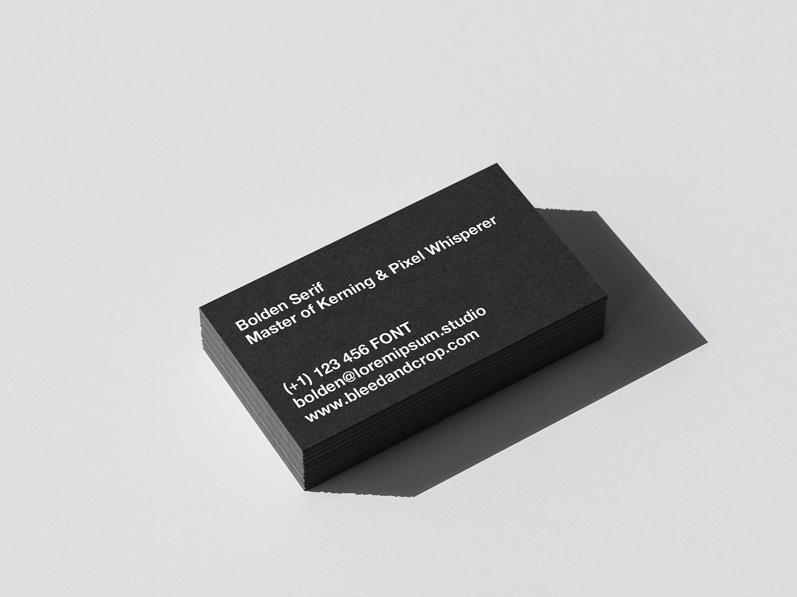
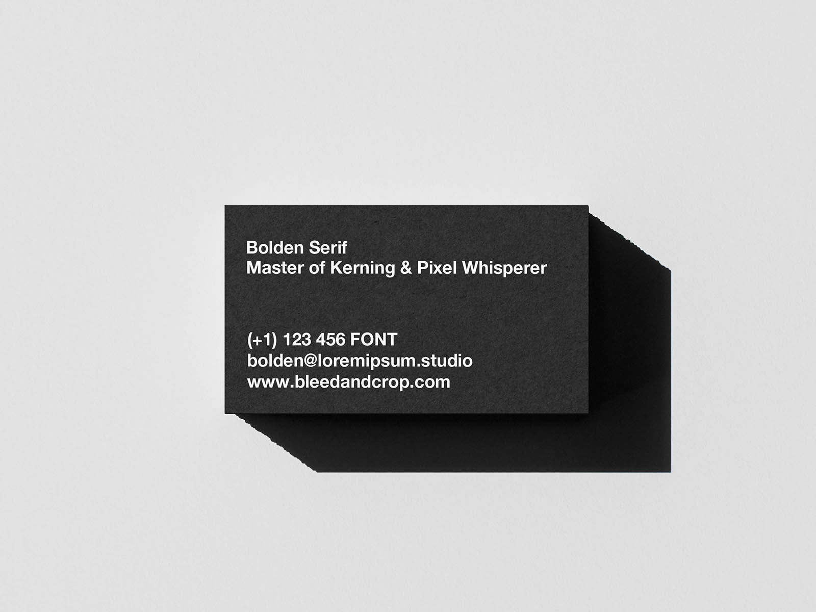
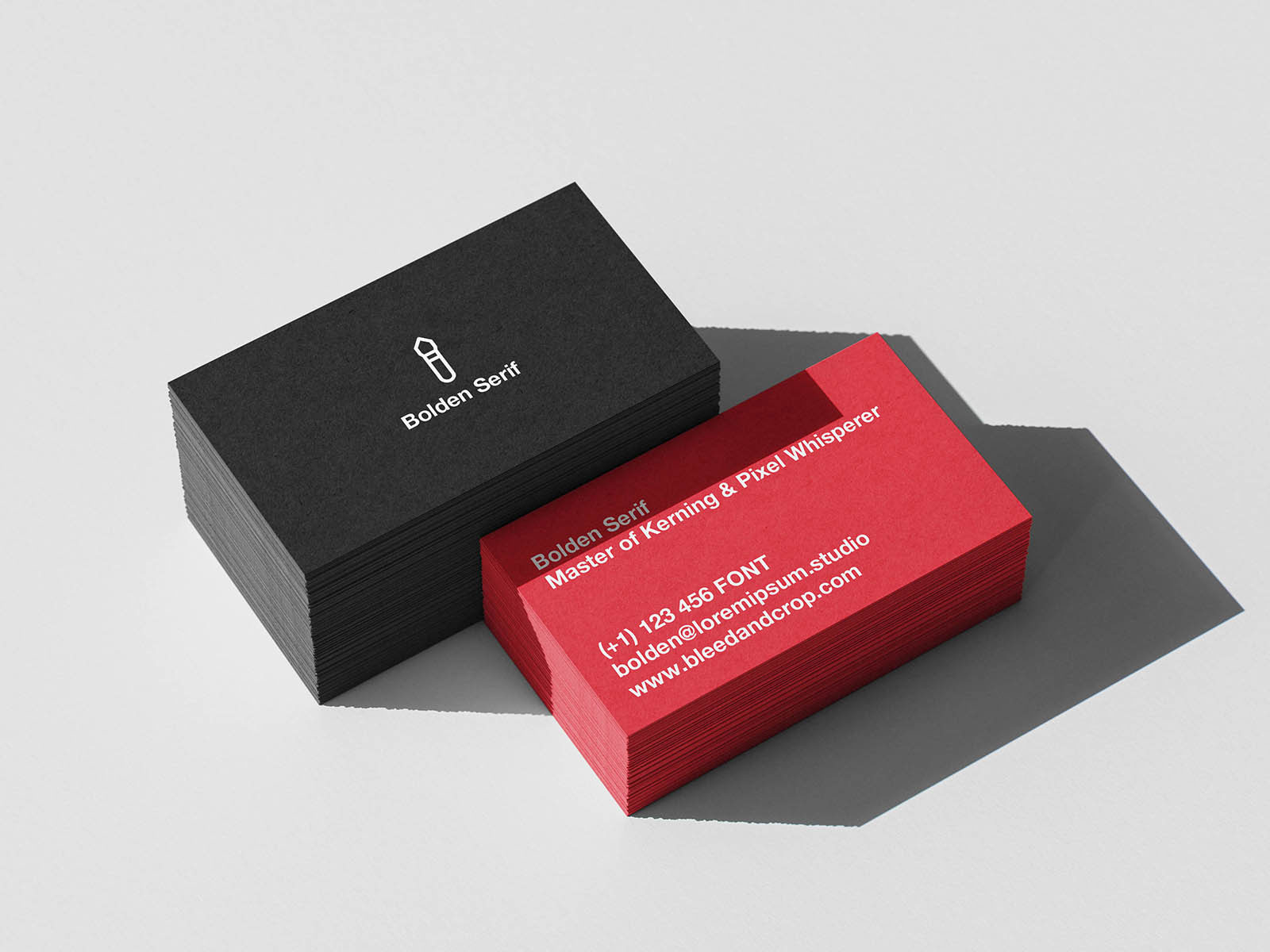
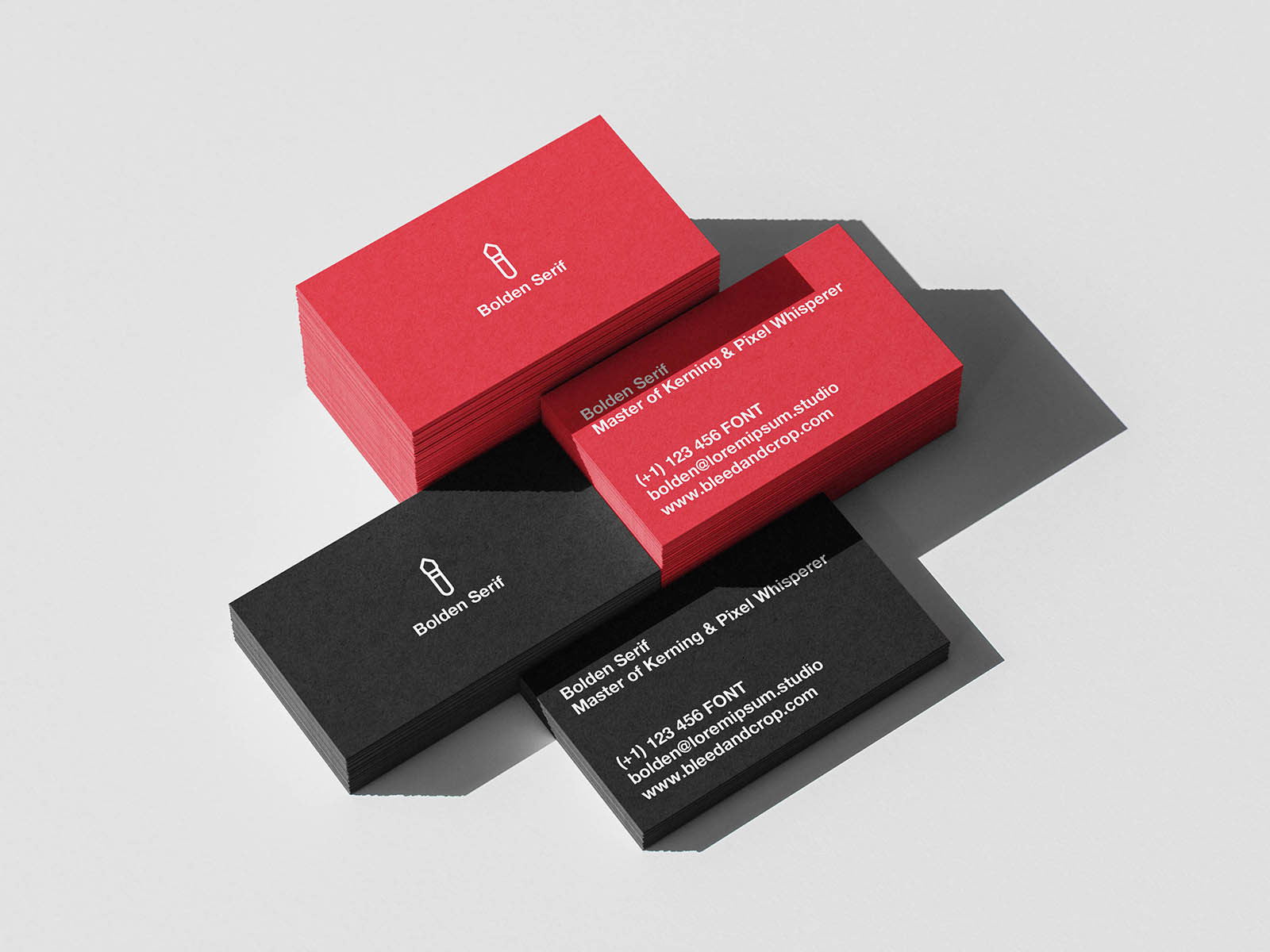
Business card mockups are brutal in the best possible way. They expose everything. Weak typography, awkward spacing, poor logo balance; things that somehow survived on your screen suddenly become impossible to ignore once the design is stacked and viewed like a real printed product. That’s exactly why this mockup is useful.
The layered presentation creates natural depth, making it easier to judge how the branding behaves beyond a flat layout. Whether you’re working on a corporate identity, luxury brand, creative studio, or personal portfolio system, this business card mockup helps answer an important question: does the design still feel professional once it leaves the artboard?