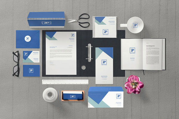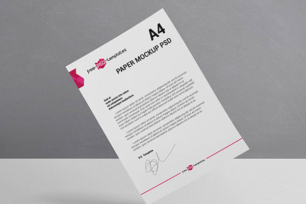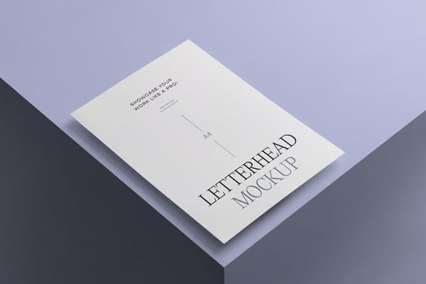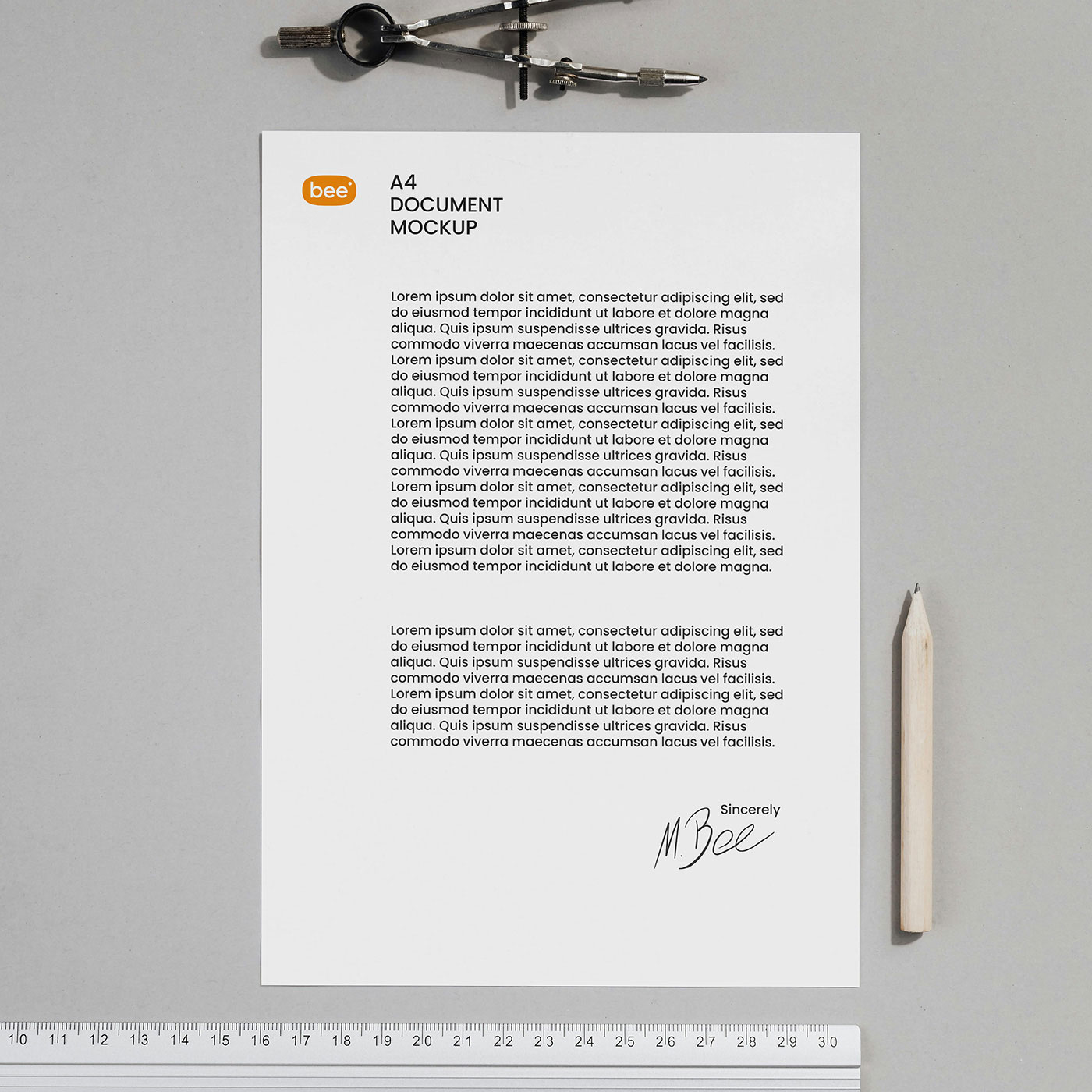
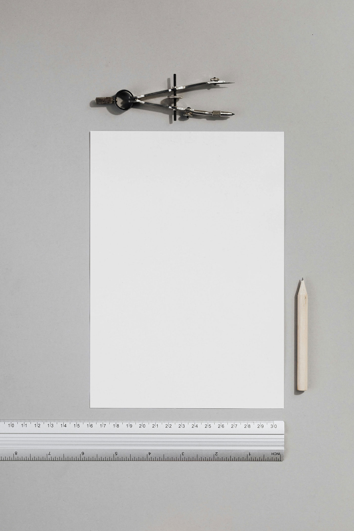
This letterhead with ruler mockup immediately stood out in your workflow because it brings a subtle but very intentional sense of precision to the presentation. The ruler element isn’t just decorative; it reinforces scale, alignment, and structure, which makes typography and spacing decisions feel more grounded and realistic.
It’s the kind of setup that helps you evaluate hierarchy and margins in a more “print-like” context rather than a flat screen preview. The clean lighting and minimal composition keep the focus entirely on the design, making this letterhead mockup ideal for presenting corporate identity or editorial stationery concepts with clarity and confidence.