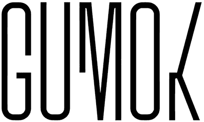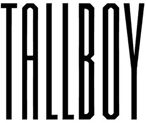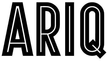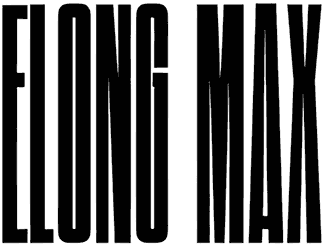
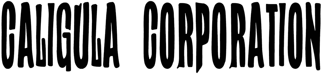
Caligula Corporation stretches its letters into tall, razor-narrow silhouettes, then roughens the edges just enough to keep them from feeling mechanical. Compressed counters, uneven contours, and subtle flares give the alphabet the look of vintage poster type pulled through a darker, more theatrical filter.
Use this tall font for dramatic posters, horror graphics, alternative music artwork, editorial covers, packaging, or unconventional branding. Its extreme condensation makes it especially effective for stacked headlines and tight spaces. Try stark black and white, toxic greens, crimson accents, or grainy print textures to emphasize its tense, slightly sinister character.
Note of Designer
Caligula Corporation.
WOODCUTTER
MMXXIII
Free For Personal Use OnlyDonation link:
https://www.paypal.me/woodcuttermanerocommercial licenses available:
contact: [email protected]http://www.woodcutter.es
Social:
http://www.facebook.com/woodcutterilustration
http://www.instagram.com/woodcuttermanero