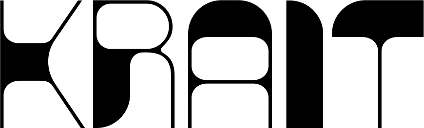
KG Architecturally Artistic has the loose precision of hand-drawn architectural notes, built from thin monoline strokes, narrow proportions, and slightly irregular geometric shapes. The uppercase and lowercase stay visually close to one another, creating a clean all-caps-like rhythm, while subtle variations in curves and angles preserve the warmth of real handwriting.
Its understated structure works beautifully for architectural presentations, moodboards, diagrams, editorial accents, posters, stationery, and casual branding. Pair this architectural font with structured grids, technical drawings, or minimal layouts when you want typography that feels personal and hand-rendered without becoming decorative or messy.
Note of Designer
License at kimberlygeswein.com