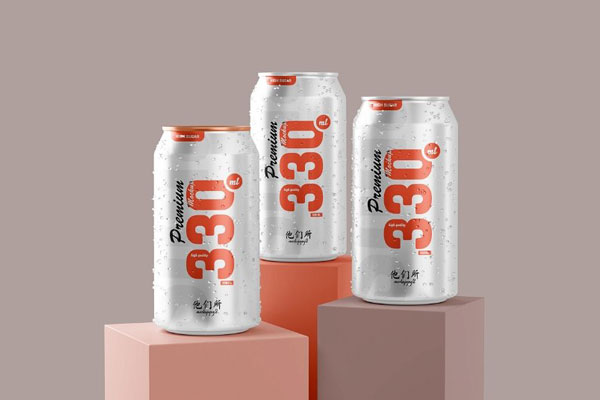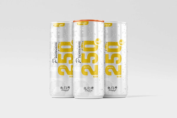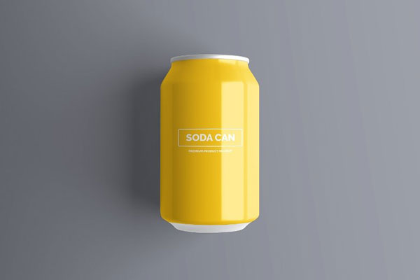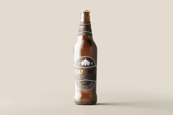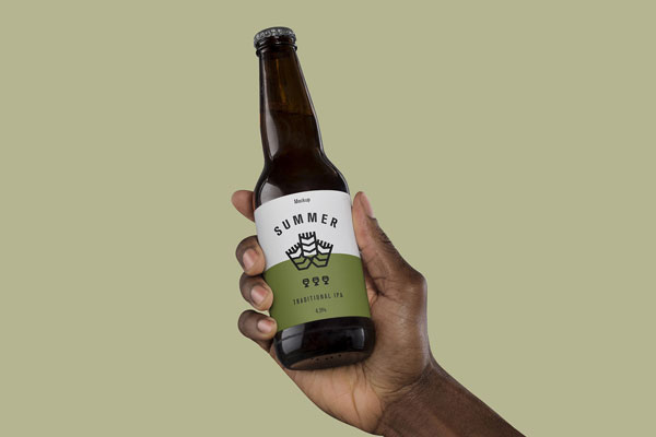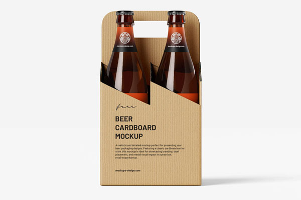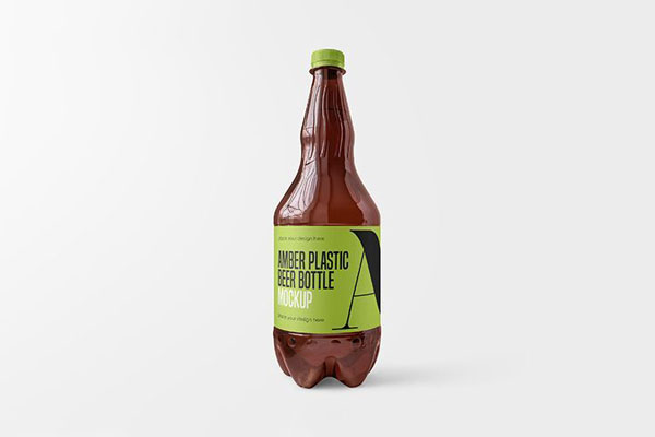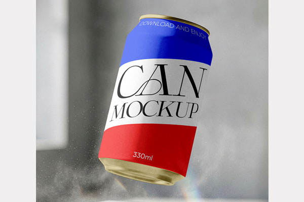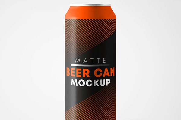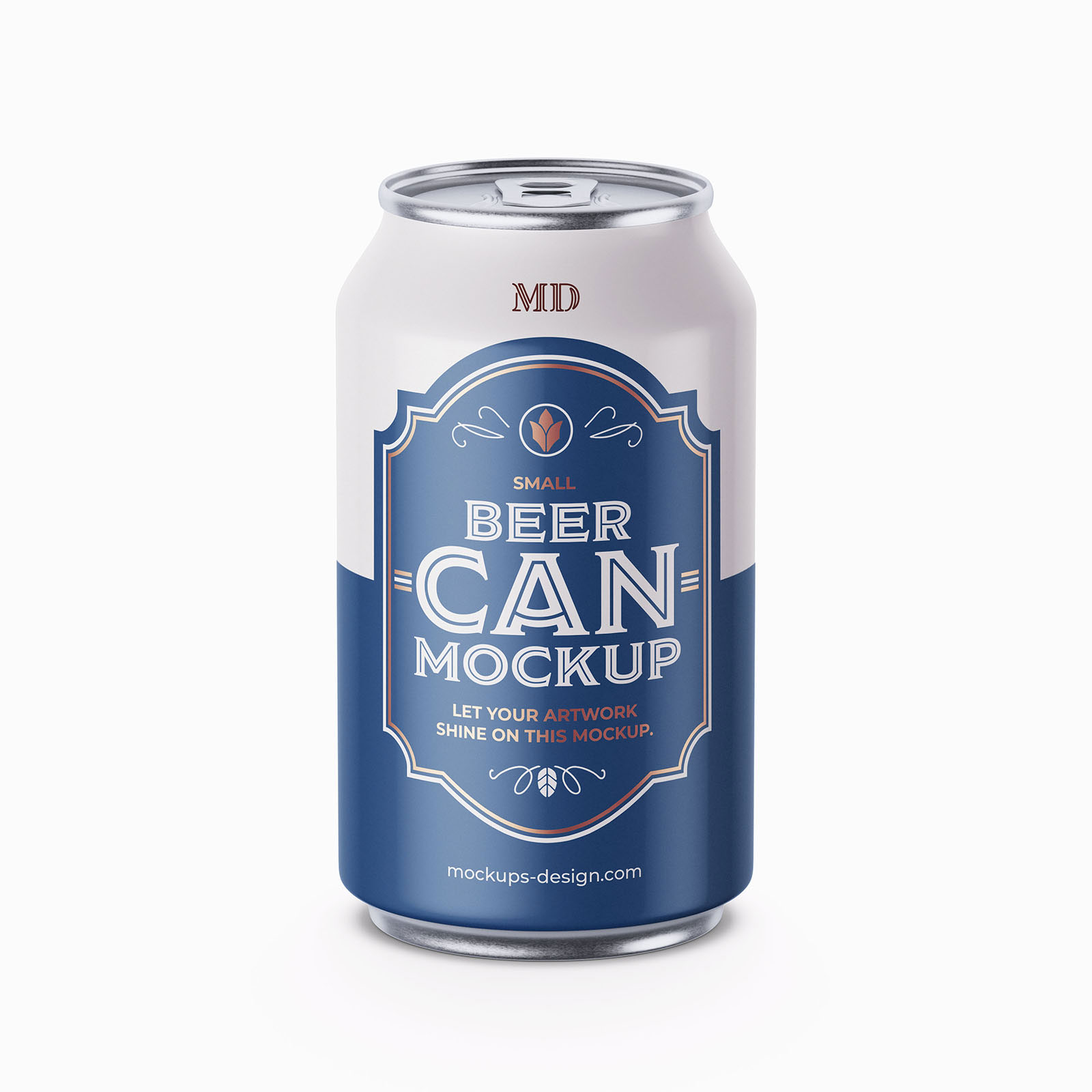
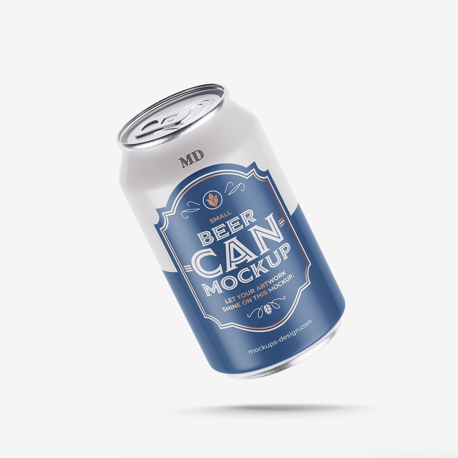
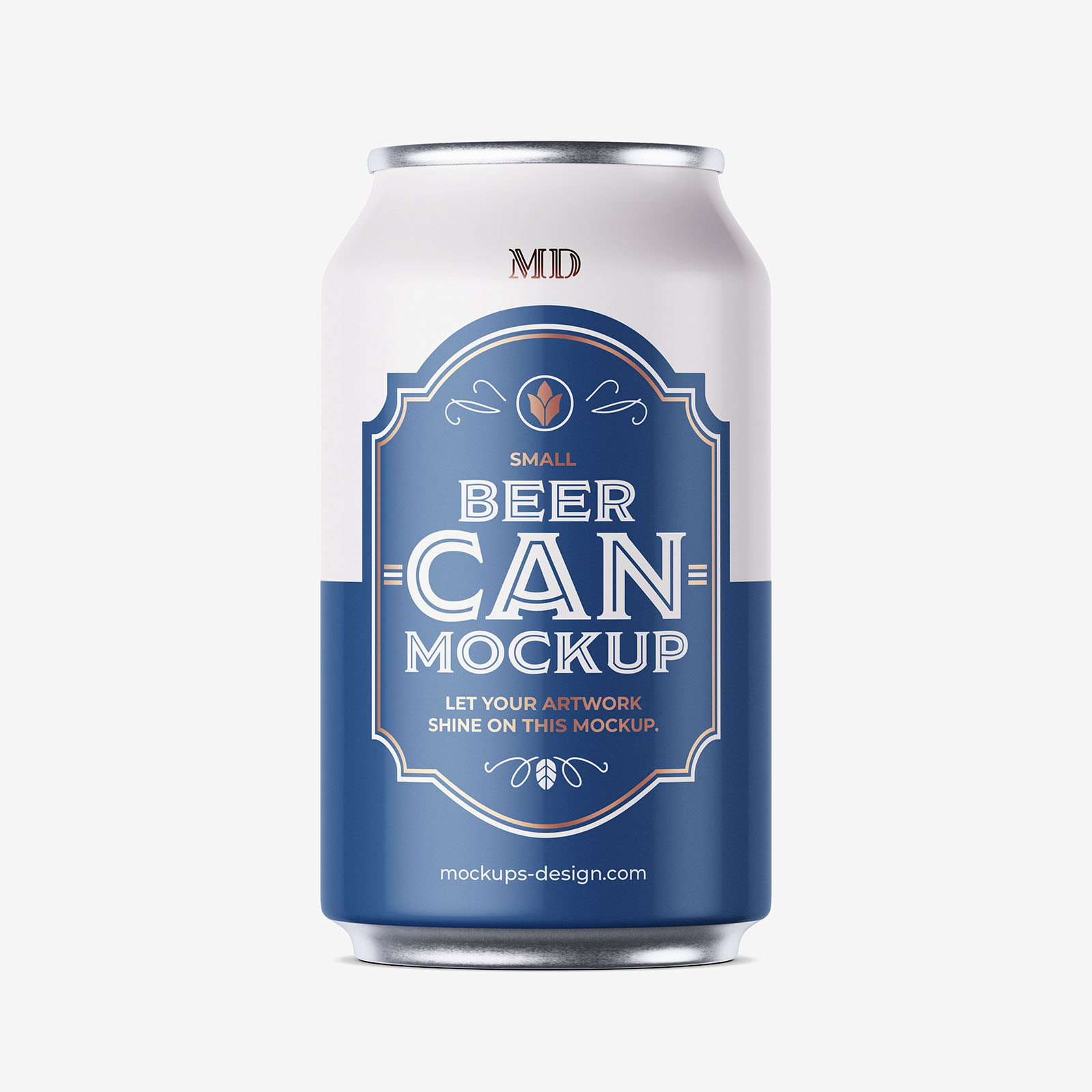
Small beer cans are surprisingly hard to design for. You’re working with limited space, curved surfaces, tiny typography, and branding that still has to stand out in a refrigerator full of competing labels. That’s exactly why a mockup like this becomes part of the design process instead of just the presentation stage.
The realistic can proportions help you notice things that stay invisible on a flat canvas: awkward spacing, weak hierarchy, or colors that don’t hit as hard as you expected. Whether you’re building a craft brewery identity or a bold beverage concept, this can mockup helps answer one important question: would this actually catch someone’s eye?