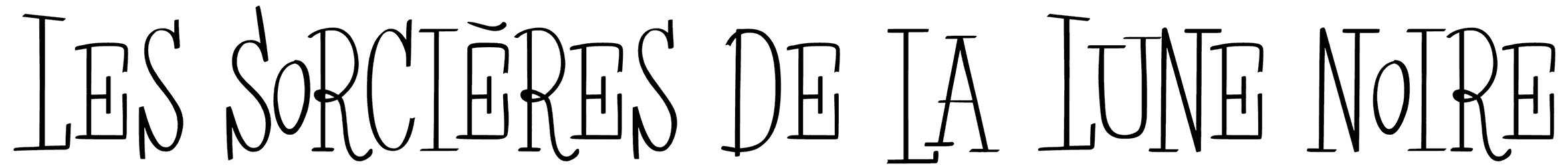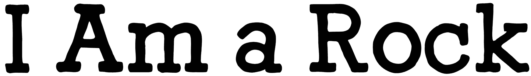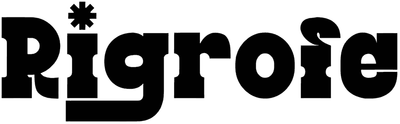
You don’t understand what’s going on here either. Good, for a second, we thought it was just us. Just look at those bold letters with those unproportioned serifs that are not even properly placed, and then the swash in “g” and the snowflake on top of “i”? In a slab serif font? What’s up with that?
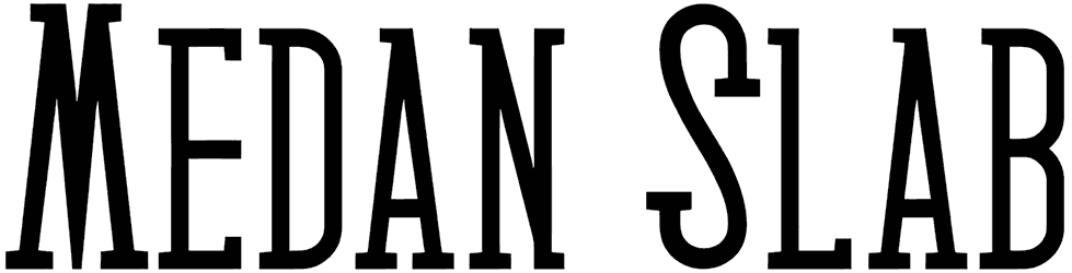
The mere paradox is enough to make sure Rigrofe ends up in your toolkit and is picked for your next modern sports equipment logos, and everything.
Note of Designer
By installing or using this font, you are agree to the Product Usage Agreement:
This font is FOR PERSONAL USE ONLY. NO COMMERCIAL USE ALLOWED!
– link to buy full version and commercial license:
https://rvandtype.com/rigrofe-slab-serif-font/
– For Corporate use you have to purchase Corporate license.
– If you need A Custom License, please contact us at [email protected]– Any donation are very appreciated. Paypal account for donation : https://www.paypal.me/RandiIrvan
Rvandtype Studio,
Thank You